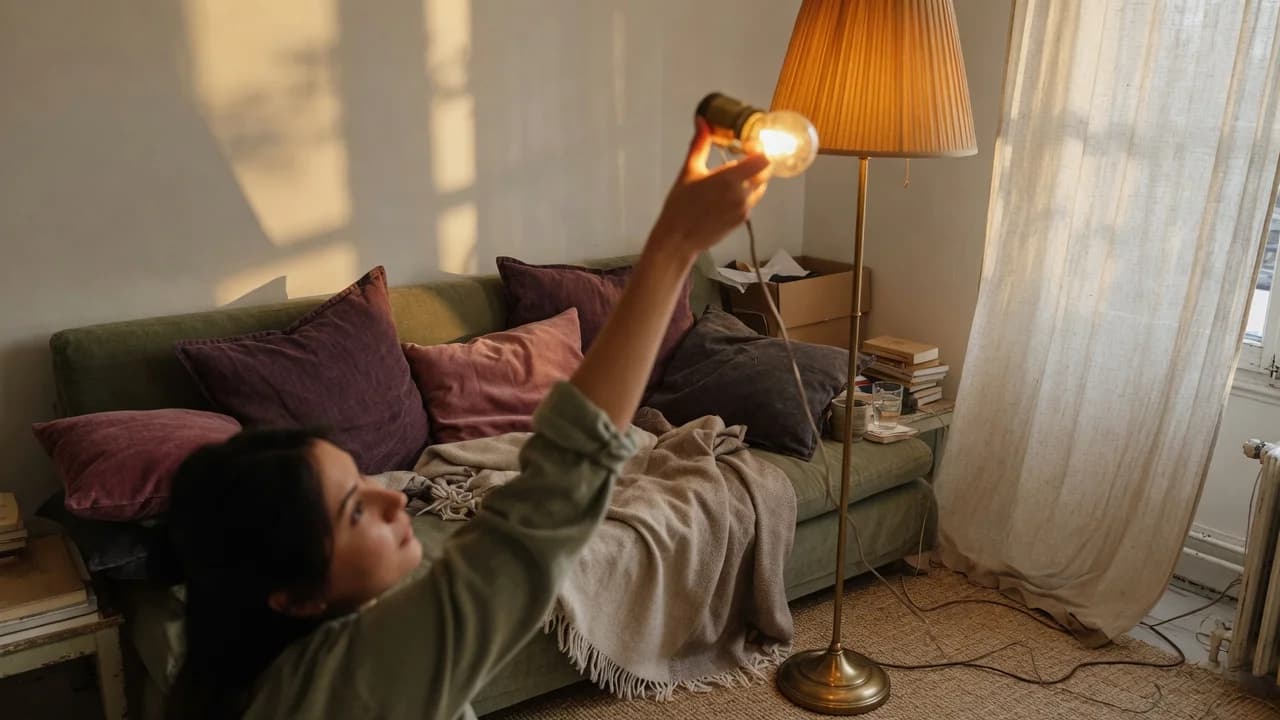
Since 2020, the percentage of US renters who believe they'll never afford a home has climbed past 50% in most major metros. That makes "just find a place that lets you paint" the least useful seasonal decorating advice in circulation. Every September, the same articles appear: burnt-orange pillows, brown plaid throws, ceramic pumpkins arrayed across surfaces. If you've scrolled through them feeling exhausted, it's not because you lack seasonal spirit. The advice treats autumn as a color scheme you shop for, when autumn is actually a set of sensory conditions your body registers long before your eyes do.
Here's the gap: declining daylight, dropping temperatures, and the instinct to reach for heavier fabric require exactly zero landlord permission. A renter can't paint a wall burnt orange without losing a deposit. But a renter can change the color temperature of every bulb in the apartment in under an hour for under $40. None of the things that create genuine autumn atmosphere involve altering the structure you're renting.
The standard advice sends you toward throw pillows and leaf garlands. Those read as "decorated for fall." What you want is a room that feels different in a way that persists past November. Light temperature, textile weight, scent, and thermal comfort are the levers, and they work harder than any garland.
Or rather, the renter's constraint is the thing that forces better decisions. A homeowner paints a wall burnt orange and stops. A renter, blocked from shortcuts, builds atmosphere from conditions upward. The result doesn't look like a seasonal aisle at Target. It looks like a room that belongs to someone who understands how space actually works on the senses.
Why "Fall Decor" Defaults to Orange
The orange-and-brown palette isn't arbitrary. It echoes turning leaves and harvest crops. That made sense when seasonal decorating meant bringing the outdoors in from land you owned. It still works for porches on suburban houses with southern exposures and trees visible through windows.
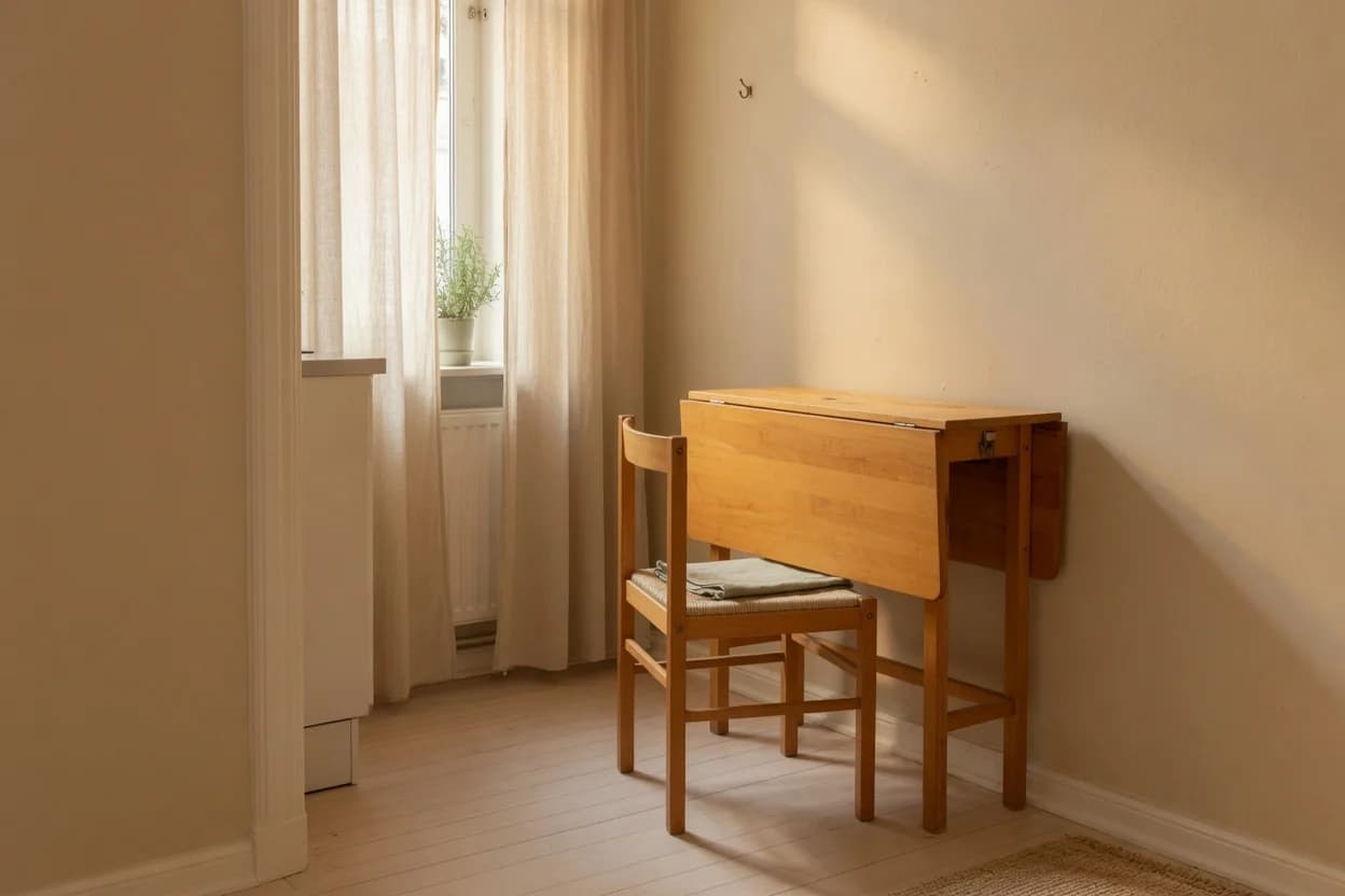
In a north-facing apartment with beige walls you didn't choose, that same palette fights the room. Orange against rental beige reads flat. Brown disappears into brown carpet. The problem isn't the colors. It's that the whole approach assumes you're decorating a neutral box you control.
Autumn isn't a color scheme you buy; it's a set of sensory conditions you create. That reframing changes the starting point entirely. Once you stop asking "what objects say fall?" and start asking "what makes a room feel like the season changing?", the answers are physical and immediate: light that matches the declining sun, textures that register as warmth against cooling air, scents that signal shelter rather than dessert.
The US Department of Energy notes that roughly 30% of a home's heating energy escapes through windows.[1] That statistic matters for atmosphere, not just bills. The sensation of autumn is partly a room that feels cooler near the glass than at its center. You can fight that with the thermostat, or you can use it as the starting condition your decorating choices respond to.
Start With the Light
Before you buy a single decorative object, swap your bulbs. The eye reads color temperature—measured in Kelvin—as atmosphere, and most apartments are lit too cool for autumn's declining daylight. Standard residential "soft white" bulbs sit at 2700K, producing a warm amber glow. "Warm white" at 3000K is slightly crisper but still well inside the range that reads as relaxing rather than task-oriented. Cree Lighting's residential guide pegs 2700K–3000K as the band for living spaces where comfort and unwinding are the goal.[2]
If your apartment currently runs on 3500K or 4000K bulbs—common in kitchens, bathrooms, and the contractor-grade ceiling fixtures most landlords install—the room is lit for chores, not atmosphere. Swapping to 2700K in living areas and bedrooms runs roughly $5–8 per bulb for dimmable LEDs. For a one-bedroom apartment, that's $40–60 total and about 45 minutes.
The effect is immediate and disproportionate to the effort. The room feels lower, slower, warmer—not because you added anything, but because you changed the quality of what was already there.
Light Temperature Quick Reference
- 2700K: amber glow, best for bedrooms and living rooms
- 3000K: warm but crisp, works for dining areas and open-plan spaces
- 3500K and above: too cool for autumn atmosphere; reserve for task areas
- Cost: $5–8 per dimmable LED bulb
- Time: under one hour for a one-bedroom apartment
Switch Textiles by Weight, Not Color
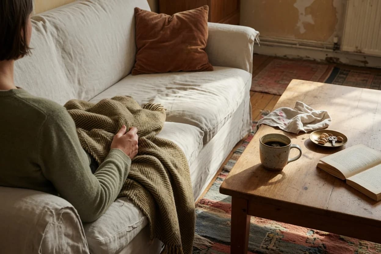
The standard advice tells you to bring in "fall colors" through throw pillows and blankets. That gets the mechanism backward. The reason you reach for a heavier blanket in October isn't because someone dyed it rust-colored. It's because the air temperature dropped. Texture and weight are the signal your body reads. Color is decoration that follows.
Swap summer-weight textiles—linen, lightweight cotton, anything that reads as breezy—for fabrics with physical heft. Wool throws, velvet pillow covers, cotton fleece blankets. The progression that works across a season: linen in summer, midweight cotton in early fall, wool and velvet by November. Apartment Therapy's seasonal swap recommendations frame this as swapping texture before color, and it's the single highest-impact change a renter can make without touching a wall.[3]
Thermal curtains are the move most renters skip. The Efficient Window Coverings Collaborative documents cellular shades with R-values of 3–5, and thermal curtains add another R-2 to R-3 when layered behind them.[4] For a renter who can't replace windows, heavyweight floor-length curtains in wool or cotton velvet do two things at once: they cut the draft you can feel near the glass and they anchor the room visually in a way that reads as considered, not seasonal.
But here's the catch. If your rental has warm-toned fixed elements—honey-oak kitchen cabinets visible from the living area, beige wall-to-wall carpet, orange-toned wood floors—layering additional warm textures can oversaturate the space. The room tips from cozy to muddy. The fix costs nothing: add one cool-toned counterpoint. A charcoal wool throw, a slate linen pillow, a single piece of dark navy. The warm layers need something to play against, or they flatten into each other.
Scent Without the Candle Aisle
The seasonal candle industry wants you to believe pumpkin spice and apple cinnamon are autumn. Those scents read as dessert, not atmosphere. They're what fall tastes like, not what it smells like as a condition of the room.
The scents that trigger autumn as an environmental shift are material scents: cedar, wool, leather, dried vegetation, the faint smokiness of a room closed against cold air. These register as shelter and warmth—the olfactory equivalent of a heavier blanket. A cedar block in a closet, a wool throw that still holds traces of lanolin, a leather coaster set, dried eucalyptus in a vase. These work because they're ambient. You don't notice them when you walk in. You notice when you realize the room feels different and can't immediately name why.
Reed diffusers beat candles for this purpose. A diffuser with cedar-and-amber oil runs continuously without the attention a flame demands. Place it near the entry so the shift registers on arrival, then fades into the background. Candles ask to be noticed. Diffusers change the room and get out of the way.
What You're Actually Choosing Between
If you spend $80 on the standard fall-decor approach—orange pillows, a pumpkin doormat, leaf garlands—you get a room that reads as "decorated for the season." In January, you pack it into a bin, and the room returns to its baseline. Nothing about how the space feels day to day actually changed.
If you spend the same $80 on the sensory approach—two 2700K LED bulbs, one heavyweight throw, two velvet pillow covers, a cedar diffuser—you get a room that feels different in a way that persists. And when spring arrives, the throw moves to a basket, the velvet covers get swapped for linen, and the bulbs stay. The curtains stay. The room works year-round, seasonally tuned rather than seasonally themed.
Here's how the two approaches compare in practice:
| Standard Fall Decor | Sensory Approach | |
|---|---|---|
| Upfront cost | $60–100 | $60–100 |
| Lease risk | Low to moderate | None |
| Storage needed | Large bin, 10 months/year | Minimal; most stays in use |
| Room feel off-season | Returns to baseline | Improved year-round |
| Permission needed | Sometimes (hanging) | Never |
The sensory approach costs the same, risks nothing, and leaves the room functioning better in every other season. The standard approach buys a theme you'll pack away. This approach buys atmosphere—and atmosphere doesn't need seasonal storage.
Swap your bulbs first. If you do nothing else, put 2700K LEDs in every socket that isn't a task-light fixture. This takes under an hour and changes the room more than any decorative object you could buy in that same time.
Then pull every summer-weight textile from the living area and bedroom. Replace them with the heaviest fabrics you already own, even if the colors don't "match." Weight first, color second. If you own nothing heavy, one wool throw and two velvet pillow covers change a room for under $60.
This week, add one material scent—cedar, dried vegetation, or wool—placed near the entry. Add thermal curtains to whichever window you sit nearest. Those two moves lock in the atmosphere the light and textiles established.
None of this requires asking a landlord. None of it screams "fall decor." And when March arrives, you won't be packing pumpkins into a bin. You'll swap the velvet covers for linen, keep the bulbs at 2700K because warm light works in every season, and wonder why anyone pays money to make an apartment look like a craft store for two months out of the year.