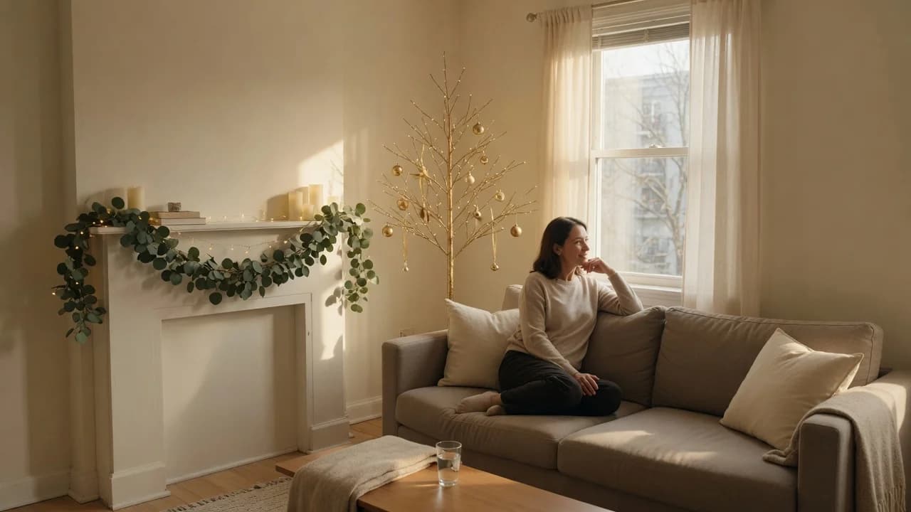
The average American apartment now measures 908 square feet, and the living room inside it often runs under 200.[1] That's the canvas you're working with when the holidays arrive. The question isn't whether to decorate. It's whether your color choices make that room feel open or like a closet.
Most advice treats neutral and traditional holiday palettes as a matter of taste. It's not. This isn't about which look photographs better. In a room under 200 square feet, color changes how far away the walls feel. Pick wrong and you've shrunk your space by Christmas Eve.
The answer turns on three things: your room's natural light, your existing wall color, and whether you host or hibernate. Get those right and either palette can work. Get them wrong and the best decor money can buy won't save it.
Why Small Rooms Play by Different Rules
Paint color doesn't just sit on a wall. It changes where your brain places that wall in space. Warm colors like red, orange, and deep green stretch across long wavelengths. Your eye's lens rounds itself to focus on them, and your brain reads that muscular effort as "close."[2] A red accent wall in a big living room feels intentional. In a small room, it feels like the wall is leaning in.
Cool, light colors do the opposite. Short wavelengths let your eye's lens flatten. The brain interprets this as distance. Light neutrals with a high light reflectance value reflect more light and push walls back, an effect confirmed by research showing that brighter surfaces consistently appear farther away than darker ones.[3] That's why a cream-colored room feels airier than the same room painted burgundy.
This isn't taste. It's optics.
Holiday decor works the same way. A red-and-green scheme in a 12-by-13-foot living room adds visual weight to every surface it touches. Stockings, garlands, tree ornaments, table runners: each piece pulls the walls inward. Neutral decor in creams, taupes, and metallics doesn't fight the room's boundaries. It works with them.
The Neutral Palette, Done Right
Neutral doesn't mean beige-everything. The people who tell you neutral holiday decor is boring have usually seen it done wrong: flat, washed-out, zero texture. That framing misses something. A good neutral palette is active, not absent. It builds depth through contrast in material, not contrast in color.
A working neutral holiday palette has three layers. The foundation: warm whites and creams. Benjamin Moore White Dove has an LRV of 83 and reads as soft rather than stark. Sherwin-Williams Alabaster and similar warm off-whites work the same way. The mid-tone: greige, taupe, or soft mushroom that bridges light and dark. The accent: metallics (champagne gold, antique brass, brushed silver) plus natural green from cedar or eucalyptus. That's it. Three tones, maximum four.
Texture does the heavy lifting here. When you remove red and green, you have to add something else. Chunky knit stockings against a smooth velvet tree skirt. Matte ceramic ornaments next to glossy glass ones. Rough pinecones beside polished brass candleholders. If every surface in the room has the same finish, neutral reads as unfinished.
The real holiday decision isn't about color at all. It's about whether your decor makes a room breathe or makes it close in.
Neutrals win on versatility too. A cream-and-gold scheme transitions straight into January without a full takedown. That matters when you're storing holiday decor in a coat closet because there's no attic.
When Red and Green Earn Their Place
Traditional red and green isn't automatically wrong for a small space. It's just harder to get right. And it works best under specific conditions.
If your walls are already a light neutral (white, off-white, pale gray), red and green decor pops against that backdrop without compounding the problem. The wall recedes; the decor advances. You get contrast without claustrophobia. But if your walls are mid-tone or warm (say, a tan or terra cotta), adding red and green piles advancing color on advancing color. The room closes in fast. And that limits your options before you've hung a single stocking.
Hosting changes the equation. Red and green read as festive to guests in a way neutrals don't always. If you're throwing a holiday party in a 180-square-foot living room, a few well-placed red accents (pillows, a runner, maybe a wreath) signal celebration instantly. The trick is restraint: pick one red item per surface, not five.
The worst version of traditional in a small room is the everything approach. Red tree skirt, green garland, red stockings, green tablecloth, red candles, green napkins. Each item adds another warm advancing surface. By the time you're done, the room feels like it shrank by a third. If you go traditional in a small space, go half as far as you think you should. Then pull back a little more.
When Neutral Falls Flat
Neutral palettes have a real failure mode, and it's not "boring." It's light.
A neutral scheme needs good natural light or warm artificial light to read as intentional. In a north-facing room, or a room with one small window, creams and taupes can turn gray and cold. What looked warm and layered in the store or on Instagram goes flat and institutional under your actual ceiling light. Traditional red and green don't have this problem. They generate visual warmth even in poor light. So the neutral route can backfire in exactly the rooms that need the most help.
The fix isn't always switching to red and green. Sometimes it's adding more warm metallic accents (brass beats silver here), using warm-white bulbs at 2700K, or bringing in wood tones that read as warm even under cool light. But if you've tried those things and the room still feels underheated, a restrained traditional palette with cream walls as a base might serve you better than forcing neutrals.
The Decision That Makes Either Work
You're not actually picking between neutral and traditional. You're picking a strategy based on three conditions.
Here's how the two approaches stack up in a small room:
| What Matters | Neutral Palette | Traditional Red & Green |
|---|---|---|
| Perceived room size | Maintains or expands | Reduces by 1 to 3 visual feet |
| Natural light needed | Medium to high | Works in any light |
| Guest-readiness | Subtle; may not read as holiday | Instantly festive |
| Post-holiday transition | Easy; stays up through winter | Needs takedown after New Year's |
| Risk if overdone | Looks unfinished | Shrinks the room |
This isn't a scoring rubric where you add columns and pick a winner. It's a filter.
Go neutral if your room has decent light, your walls are already light, and you value a calm space that works past December. Go restrained-traditional if you host, your room faces north or has weak daylight, and you're willing to edit ruthlessly.
Before you spend a dollar on holiday decor, run through these:
- Measure your light first. Stand in the room at noon. If you need lamps to read a book, you're in low light. That tilts toward traditional.
- Check your wall color. Light neutral walls with an LRV above 60 can handle either palette. Mid-tone or warm walls tilt toward neutral decor to avoid doubling up on advancing color.
- Count your surfaces. In a room under 200 square feet, you've got maybe four decorating zones. If you're filling all of them, go neutral to avoid visual crowding.
And if you're in between? Start neutral. Add one red item. A throw pillow, a single garland strand, a bowl of ornaments. Live with it for three days. If the room still breathes, you're good. If it tightens up, pull the red back out. Neutrals are easier to dial up than red and green are to dial down.
Paint your walls a light neutral before you buy a single holiday decoration. Not cream with yellow undertones. True warm white or greige. A common guideline: aim for an LRV above 60 on your main wall color. That single surface covers more square footage than everything you'll hang, wrap, or drape. And it determines whether the rest of your choices read as cozy or cramped. Everything else (palette, texture, accent color) is downstream of what your walls are already doing to the room. Fix that first.