
A gallon of quality interior paint runs $45 to $75 at any Sherwin-Williams or Benjamin Moore retailer in the US, and that figure hides the real cost: repainting an entire bedroom because the calming blue-gray you chose turns the space into a walk-in freezer by day three.
The problem isn't that you picked the wrong color. It's that the paint industry's default idea of soothing leans heavily toward cool tones, and those colors read as flat-out cold in roughly half the bedrooms in this country. The advice that says calm colors are cool colors is only half right. The half it leaves out determines whether you'll actually want to spend time in the room.
What decides this isn't taste. It's a number on the back of your paint chip that most people never check, and the direction your windows face. Nail those two variables and you can use almost any color family without freezing yourself out.
This article is not a roundup of every beige on the market. It's a method for identifying which calm colors will work in your specific bedroom, and why the standard advice fails for north-facing rooms, east/west rooms with shifting light, and sun-drenched south-facing spaces in warm climates.
Why Calming Keeps Producing Cold Rooms
A friend of mine painted her north-facing bedroom Sherwin-Williams Accessible Beige, a color that shows up on every best warm neutrals list on the internet. Gray-beige, warm undertones, designer-approved. She hated it within a week. The room didn't feel warm. It felt dim and vaguely dirty, like overcast weather had moved indoors and refused to leave.
The color was warm. The result was cold. That's the gap most advice doesn't address.
The logic that leads people here seems sound: cool colors are calming, bedrooms should be calm, therefore paint your bedroom a cool color. Benjamin Moore's guidance confirms that cool colors evoke relaxation and calm.[3] But color psychology happens under neutral light in a lab. Your bedroom has actual windows facing an actual direction, and the light coming through them rewrites whatever the chip promised.
When a cool color hits cool light, the undertones compound and what was supposed to feel like a spa reads as a refrigerator. But the less obvious failure, the one that trips up people who already internalized pick warm colors, is when a warm color with the wrong light return lands in a dim room and goes muddy. Warmth isn't just about undertone. It's also about how much light bounces back off the wall.
LRV: The Number Your Paint Chip Is Hiding
Light Reflectance Value. Every major paint brand prints it on the spec sheet. It's a 0-to-100 scale: 0 absorbs all light, 100 reflects all light.[4] Designers check it before they look at the color name. Most people skip it entirely.
Or rather: most people don't know it exists, because the paint store doesn't volunteer it and the chip makes no effort to explain why it matters.
Here's why it matters for a bedroom you don't want to feel cold: LRV controls perceived temperature more than hue does. A high-LRV cool blue bounces enough light around the room that it reads as airy rather than icy. A low-LRV warm beige can feel oppressive and cave-like despite technically being warm. The number overrides the name every time.
The sweet spot for a bedroom that feels calm but not cold sits between LRV 55 and 75. That range keeps the room feeling open and light without washing out under bright conditions.[4] Below 50, the walls start absorbing more light than they reflect, and the room begins to close in. Above 80, you're in bright-white territory, which can feel sterile if the room faces north.
This is the mechanism most guides skip. They tell you to choose warm colors without explaining that warmth comes from two places: undertone and light return. LRV is the light return. If the number is too low, even the warmest undertone can't save you. Open your paint chip right now and find the LRV. If it's not printed there, every brand's website lists it on the product detail page.
Your Window Direction Rewrites Every Rule
Paint doesn't exist on your wall the way it looks on the chip. Your room's orientation filters every color through its own light temperature, and the result can invert what you thought you bought.
North-facing rooms get cool, indirect light all day, no direct sun, just steady blue-gray cast. Sherwin-Williams advises avoiding colors with cool undertones since those cool tones will make the room appear colder.[1] Warm neutrals and colors with yellow or pink undertones compensate for the cool light. LRV should stay above 60 in north-facing bedrooms; below that, the room starts to dim.[4] If you want a dark, moody north-facing bedroom, you still need warm undertones in whatever deep color you choose.
South-facing rooms flood with warm light. They're forgiving. Almost any color works, but a too-warm paint can tip into aggressive territory by mid-afternoon. If your south-facing bedroom already runs hot from sunlight, a cooler neutral with blue or green undertones can read as calm rather than cold because the warm light cancels the cool bias. South-facing rooms can handle almost any LRV.[4]
East- and west-facing bedrooms are the trickiest because the light shifts dramatically. East rooms get warm morning light and cool afternoons. West rooms get the reverse. For bedrooms with east or west exposure where usage is consistent throughout the day, a neutral color helps create a balanced feel.[1] Mid-LRV neutrals, roughly 55 to 70, with subtle warm undertones handle the swing best. If you use the room mainly at one time of day, pick for that light: warm undertones for morning-use east rooms, cooler undertones for evening-use west rooms.
Colors That Calm Without the Chill
Calm isn't a color temperature; it's a color that cooperates with your light.
With that principle in hand, here's what actually works by window direction. These are starting points. Sample them in your room at morning, noon, and evening before committing. Every recommendation below sits in the LRV 55 to 83 range, and every one has warm undertones visible when you hold a sheet of white printer paper next to the chip.
For north-facing bedrooms: Benjamin Moore White Dove (LRV 83, warm creamy undertone, specifically recommended by Benjamin Moore for north-facing rooms),[2] Sherwin-Williams Alabaster (LRV 82, warm white), or Benjamin Moore Revere Pewter (LRV 55, warm greige). If the room gets some eastern or western spill light, Edgecomb Gray (LRV 63) is worth sampling.
For south-facing bedrooms: Sherwin-Williams Repose Gray (LRV 58, subtle warm-cool balance that stays fresh under warm light), Benjamin Moore Pale Oak (LRV 69, soft taupe), or Sherwin-Williams Rainwashed (LRV 60, blue-green that reads calm without going cold in southern exposure).
For east/west bedrooms: Benjamin Moore Edgecomb Gray (LRV 63, warm greige), Sherwin-Williams Accessible Beige (LRV 56), or Benjamin Moore Classic Gray (LRV 74, warm off-white).
Three things to check before you buy: your room's compass direction, the LRV number on the spec sheet, and whether the undertone leans warm or cool against white paper. Skip any one of those and you're gambling.
When Warm Undertones Backfire
There's a specific scenario where chasing warmth makes things worse, and it's common enough to deserve its own warning.
South-facing bedrooms in warm climates, think Texas, Arizona, Florida, Southern California, already receive intense direct sunlight for much of the day. A warm white like Alabaster at LRV 82 in a south-facing Phoenix bedroom at 3 PM in July doesn't read as cozy. It reads as aggressively yellow. The warm light amplifies the warm undertone until both max out.
In these rooms, you want a neutral with restrained undertones. Sherwin-Williams Pure White at LRV 84 carries the faintest possible yellow-cream undertone, too subtle to register as warm in most conditions, but enough to prevent clinical coldness.[4] It's one of the most lighting-stable whites available and reads as a clean, non-blue white even under north-facing cool daylight. Benjamin Moore Chantilly Lace at LRV 90 sits near the top of the practical LRV range with near-zero undertone, and will read as calm and clean rather than cold because the ambient warmth already in the room does the work those warm undertones would normally do.[4]
The rule inverts: when your room supplies the warmth for free, let it. Don't double up. If you ignore this and go warm-on-warm in a sun-drenched south-facing bedroom, the result isn't calming at all. It's a room that feels visually overheated, and you'll find reasons not to be in it.
Tonight, grab a compass app and figure out which direction your bedroom windows face. That single piece of information eliminates roughly two-thirds of the paint chips in the store before you even look at colors.
This weekend, pull the LRV number on any color you're considering. If the chip doesn't show it, the brand's website will. Target LRV 55 to 75 for most bedrooms. Push higher, into the 70 to 83 range, for north-facing rooms. Stay in the 55 to 70 band for east/west rooms. Write the number next to the color name on your shortlist. If two colors you're comparing are more than 10 LRV apart, you're choosing between different design intents, not similar shades.
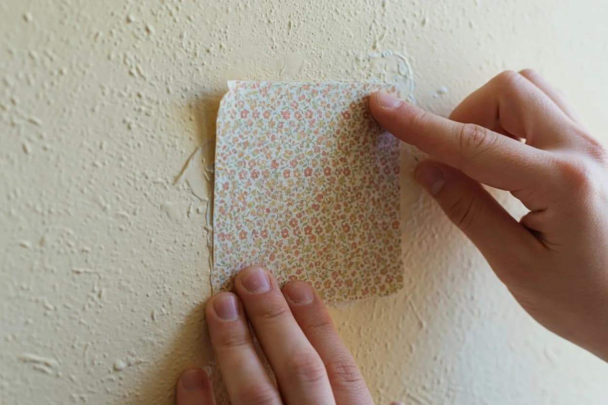
Before you buy paint, get sample pots of your top two choices and paint 2-foot squares on two different walls: one that gets morning light, one that gets afternoon light. Live with them for 48 hours. Look at them with the lights on and off. If either one reads cold or sterile at any point during the day, cross it off. The right color will feel neutral-to-warm at every hour. Not just at 2 PM when the sun is cooperating.