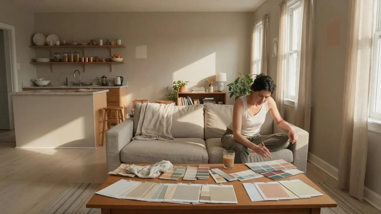
You're standing in a 900-square-foot open apartment holding a dozen paint chips. From the sofa you'll see three walls at once: living room, kitchen, hallway. Each color looks fine on its own. Put them together and the whole thing falls apart.
That's because you're picking colors room by room instead of by sight line. Whether your palette works comes down to which walls share your field of view, where your light comes from, and how much of it each color bounces back.
Room-by-Room Color Thinking Is the Real Problem
Paint-choosing advice usually treats each room as its own world. That works in a house with doors. In an open apartment you don't have doors. You have sight lines. From one sofa spot you might see the living room wall, kitchen backsplash, hallway, and bedroom door frame. All in one glance. Four different colors, one field of view.
When those colors don't relate, your eye registers chaos even though each color is fine alone. Your living room's Agreeable Gray is a top-selling neutral. But if the kitchen wall you see from the same couch is cooler Repose Gray, the warm undertone suddenly reads dingy. Your brain isn't judging colors in isolation. It's comparing them at the seam.
That's the mistake that sends people back to the paint store. They blame the color. The real culprit is the relationship between the color and what sits next to it in their field of vision. Fix that relationship and most colors work. Ignore it and even designer-approved neutrals clash. This isn't about picking the perfect beige. It's about picking colors that survive the sight-line test.
How Colors Shift Across Sight Lines
Color is a product of light hitting a surface and bouncing into your eye. In an open apartment, the light hitting your living room wall at 2 PM is different from the light hitting your kitchen cabinets at the same moment. One gets south-facing sun. The other sits in shadow. Same paint, two readings.
This is where Light Reflectance Value (LRV) beats guesswork. LRV is a number from 0 to 100 printed on the back of most paint chips. Zero absorbs all light; 100 reflects all of it.[1] When two colors with different LRVs share a sight line, the lighter one pulls forward and the darker one recedes. That's not a problem. It's a tool. But it has to be deliberate.
Designers use LRV gaps on purpose. A 10- to 20-point difference between a main wall and an accent wall creates depth without looking like a mistake. A gap under 5 points often reads as a failed match. The eye catches the near-match and registers it as wrong even though you couldn't name why.
Then there's undertone. Every neutral has one: green, blue, pink, yellow, violet. Two grays with the same LRV but different undertones fight across a sight line. A green-undertone gray makes a violet-undertone gray look purple. Neither color is wrong. They just weren't meant to share a view. (And if your apartment gets morning light in one room and afternoon light in the next, undertone clashes get worse.)
The table below gives you a starting point for matching LRV ranges to typical apartment light conditions.
| Light Condition | LRV Range | Example (Sherwin-Williams) |
|---|---|---|
| North-facing (cool light) | 55–75, warm undertone | Accessible Beige (LRV 58) |
| South-facing (warm light) | 50–70, any undertone | Agreeable Gray (LRV 60) |
| No natural light | 65–85, warm undertone | Alabaster (LRV 82) |
| Whole-plan anchor | 55–65, neutral undertone | Agreeable Gray (LRV 60) |
These aren't rigid rules. They keep you from picking something the room's light will punish.
Build Your Palette From the Sight Lines Out
The method starts not with a color but with a map. Stand where you spend the most time, probably the sofa, and note every wall surface you can see without turning your head. Those are your primary sight lines. Turn 90 degrees and repeat. Those are your secondaries.
This is where it changes. You're not painting rooms. You're painting sight lines. The palette has to read as one composition from each of your main viewing positions.
From that map, pick an anchor color for the largest surface in your primary sight line. Benjamin Moore's whole-house color approach calls this the dominant color: the backdrop everything relates to.[2] Make it the most flexible neutral in your palette. A warm greige with LRV between 55 and 65 handles north-facing cool light and south-facing warm light without going flat or yellow.
Now pick your secondary colors for walls you see alongside the anchor. And here's the rule: every secondary must share the anchor's undertone family. If your anchor leans green-gray, every secondary in the same sight line also leans green-gray. Shift lighter or darker by 10 to 20 LRV points. Don't shift undertone. That's the constraint.
Apply the 60-30-10 rule across your sight-line composition, not room by room. Sixty percent of visible surfaces get the dominant color. Thirty percent get the secondary. Ten percent get the accent.[3] The accent is your real color: a deep green, navy, or rust. Keep it to one small wall or a bookshelf. It breaks the neutrality without breaking the palette.
When the Sight-Line Method Falls Apart
The sight-line method assumes you control the paint. If you're renting, you might not. Most US landlords allow painting if you repaint before move-out. But some won't budge. If paint is off the table, build your palette through furniture, rugs, and art. Same rules: pick an anchor, stick to one undertone family, use 60-30-10. The scale shrinks. The logic holds.
The method also weakens when natural light varies sharply across sight lines. A north-facing kitchen next to a south-facing living room will shift colors dramatically. The same LRV 60 greige that reads warm in the living room at noon reads gray and cold in the kitchen at the same moment. Go lighter in the bright room and warmer in the dim one. A 15-point LRV gap between those spaces isn't a flaw. It's compensating for physics.
For shotgun layouts where you see straight from front door to back window, pick one wall color for the whole corridor. And vary it through sheen alone. Eggshell on living room walls, satin in the kitchen, matte in the hallway. Same color, different finishes. The light hits each differently. So you get variation without an undertone clash.
Get the Samples Right Before You Commit
Paint chips lie. Every designer knows this. A two-inch square under store lighting tells you nothing about how a color reads on a 12-foot wall at 4 PM. You have to test.
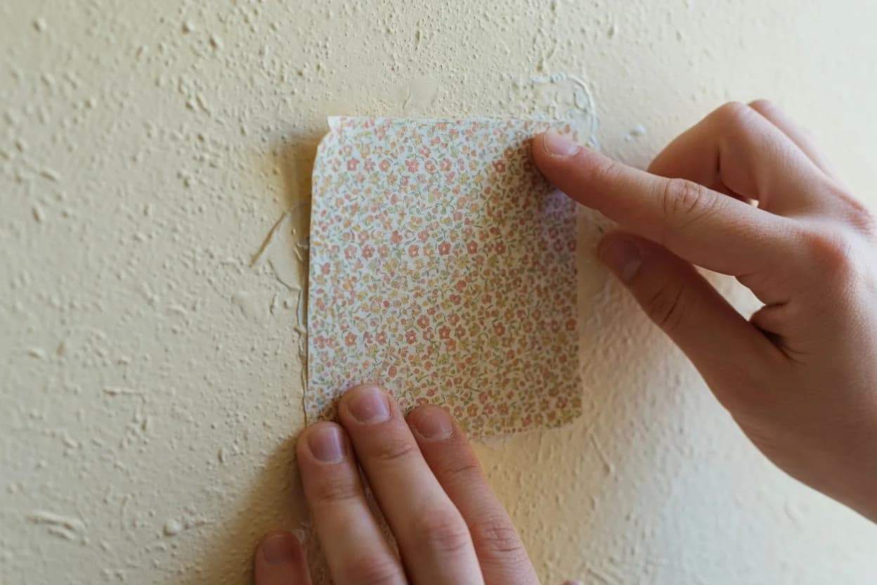
Get peel-and-stick samples for your top three or four colors. Sherwin-Williams and Benjamin Moore sell them for around $5 each. Put each sample on every wall in your primary sight line. Live with them for 48 hours. Look at 8 AM, noon, 4 PM, and 9 PM with lights on. The mistake that keeps showing up: testing a color on one wall and calling it done.
The better question is whether the colors hold their relationship across different times of day. A color you love at noon that turns muddy at dusk isn't good for a wall you'll see every evening. Three out of four time checks looking right is probably fine. Two looking off means drop the color.
Hold samples edge to edge at the seam between rooms. That's where the palette works or fails. If the transition reads as a clean shift, you've got it. If your eye stutters at the seam, swap one of the adjacent colors. Don't rationalize it. Your eye won't lie.
Before you commit to any gallon:
- If a color reads differently at 8 AM vs. noon, check which time you use the room most. Prioritize that lighting.
- If two colors share a seam and your eye catches at the transition, swap the cooler one for a warmer variant.
- If a color looks great on one wall but dead on another, the LRV is fighting the light on that wall. Drop it.
Pick your anchor color first. Not your favorite color. Not the trending color. The one neutral with LRV between 55 and 65 and a clear undertone you can name. Put it on the largest surface in your primary sight line. Everything else follows. Don't buy a gallon of anything else until you've lived with the anchor for a week and tested your secondaries at the seams. Get the anchor wrong and you'll repaint. Get it right and the rest is arithmetic.