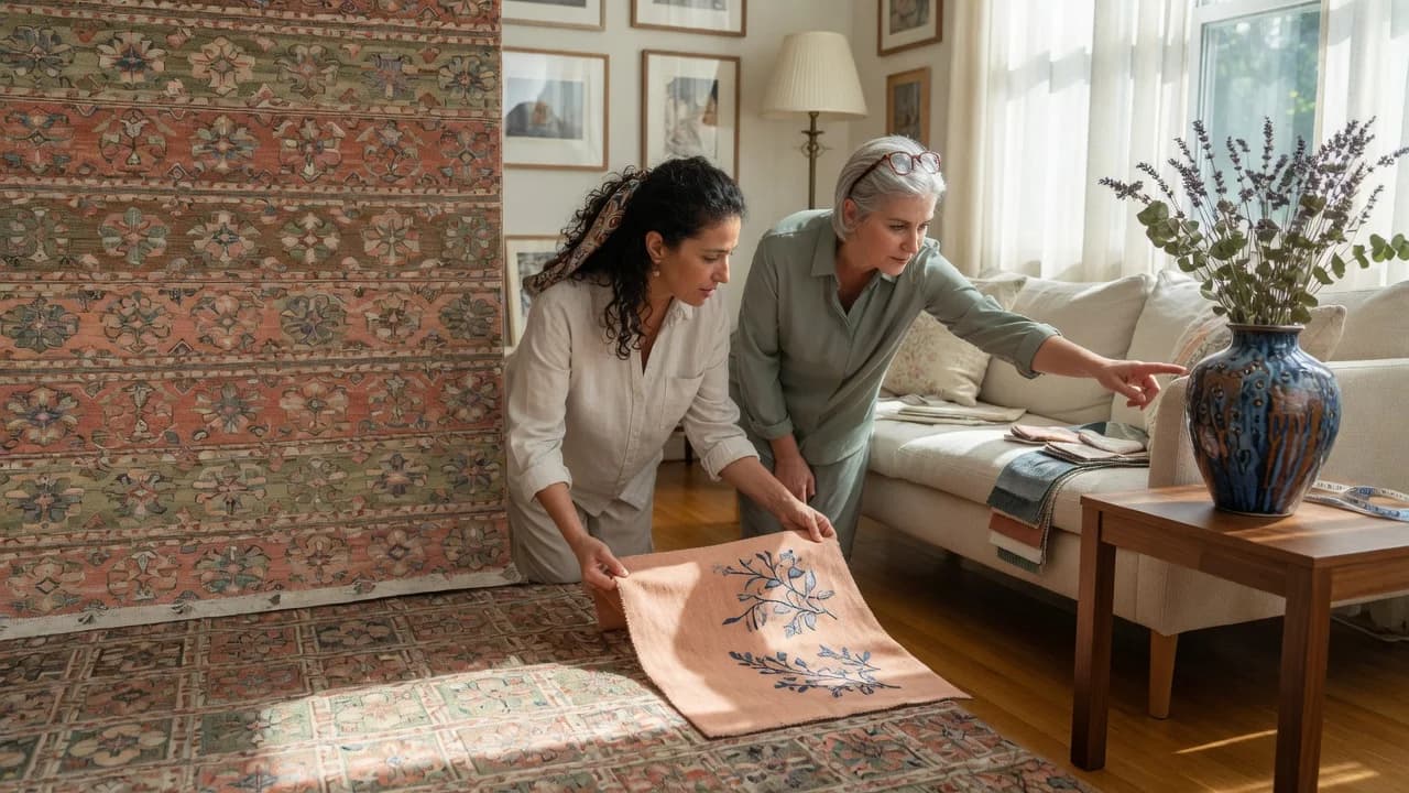
Since the home refresh boom that kicked off in 2020, more people have been decorating solo without a designer's eye on the room. Standard advice says pick a color you love and add pillows, but rooms built on preference alone tend to read as disconnected collections of stuff rather than designed spaces. The accent color that actually works is the one already living in your rug, your art, your sofa's undertone, waiting to be pulled forward rather than imported from a trend list. Most articles skip the method entirely: they tell you to pick teal because it's trendy or navy because it's timeless, neither of which helps when you're standing in the pillow aisle at HomeGoods holding three options that all feel wrong. The question isn't what color you like. It's whether you can see the color that's already there. And isolated colors fight the room every time.
Why Most Accent Color Advice Fails
The typical guidance on accent colors falls into two camps. Camp one says use the 60-30-10 rule and then abandons you at the hardest part, which is naming which specific color occupies that 10% slot.[1] Camp two hands you a list of "best accent colors for 2026" as though burnt orange works in every room equally. Neither works.
The 60-30-10 rule is useful math. It says 60% of the room should be a dominant color, 30% a secondary, and 10% an accent.[1] But proportions don't pick pigments. A room with 10% of the wrong blue is still wrong.
The deeper problem: most advice treats accent color as something you add. You bring a color into the room. Rooms that look effortlessly styled do the opposite. The accent color looks like it was always supposed to be there. It came from something already in the space.
Your room already knows its accent color; you just haven't asked it yet.
Pull Color From What's Already There
Sherwin-Williams tells homeowners to "think of a favorite rug, piece of art or fabric in your space" and "use these combinations as a guide" for color selection.[2] That's the right instinct. Most people stop there.
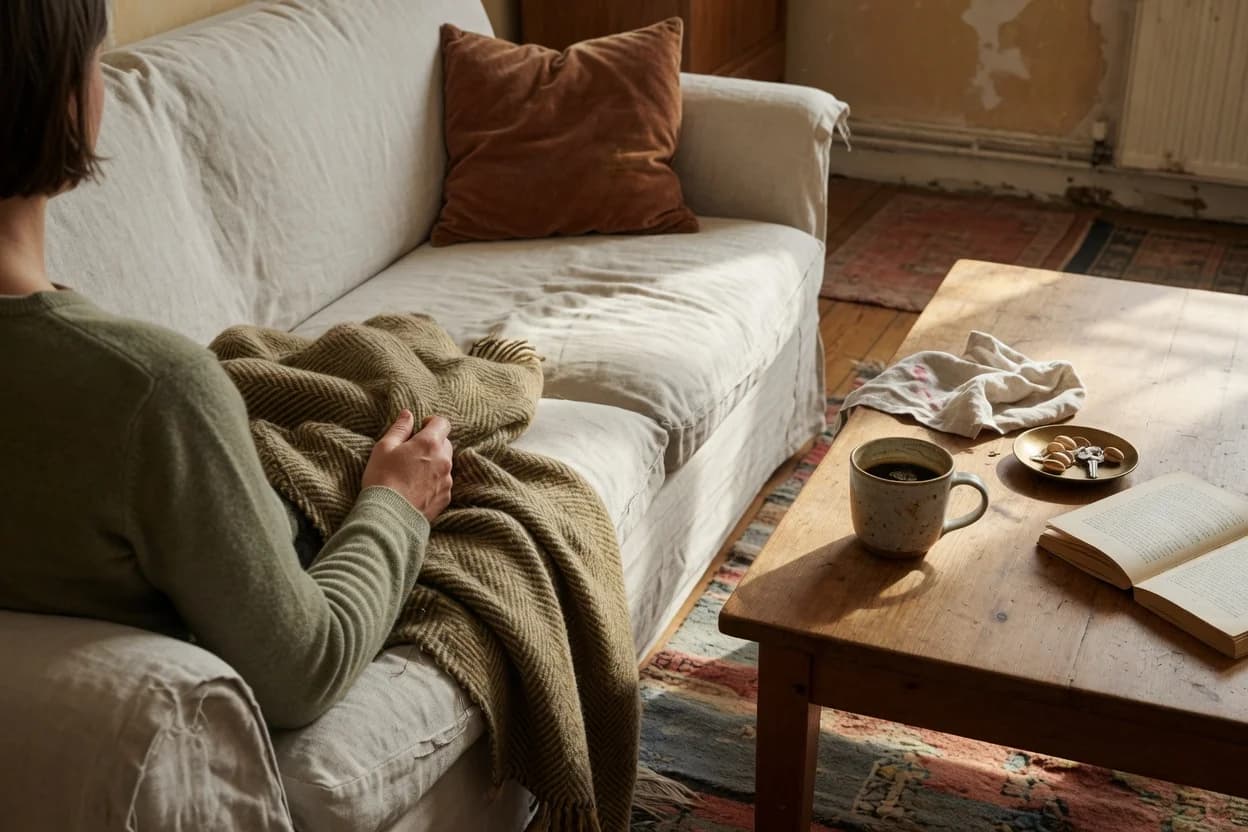
The extraction method goes further. Find the one object in the room you cannot or will not replace: the area rug, a large piece of art, the sofa, or the kitchen backsplash in an open-plan space. Study it at close range under natural light. Identify the color that appears least frequently in that object. That's your accent color.
The logic is counterintuitive: the rarest color in your anchor object is the one that will feel most intentional when repeated. If your rug is primarily cream and sage with a thin thread of rust running through the border, rust is your accent. Pulling rust into pillows, a throw, and a small ceramic piece makes the rug look smarter, not louder. The eye registers the relationship without being told.
The extraction method at a glance: Anchor object, then rarest color within it, then test that color, then repeat in 3 to 5 places. No color wheel required.
Put more precisely: the extraction method isn't about matching. It's about revealing a relationship that's already physically present in the room. Matching would mean buying pillows in the rug's dominant cream, which disappears into the sofa. Extraction means amplifying the quietest note until the whole composition reads as intentional.
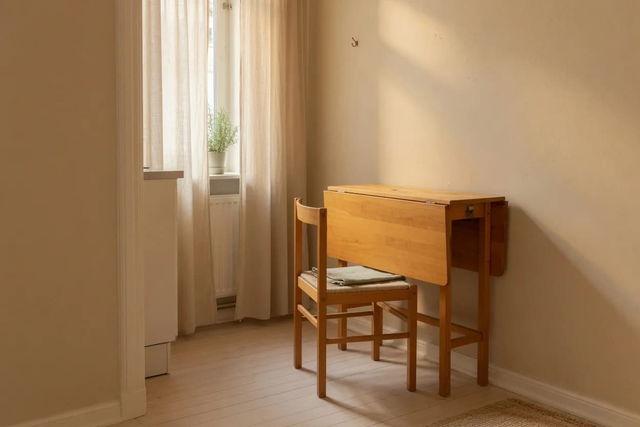
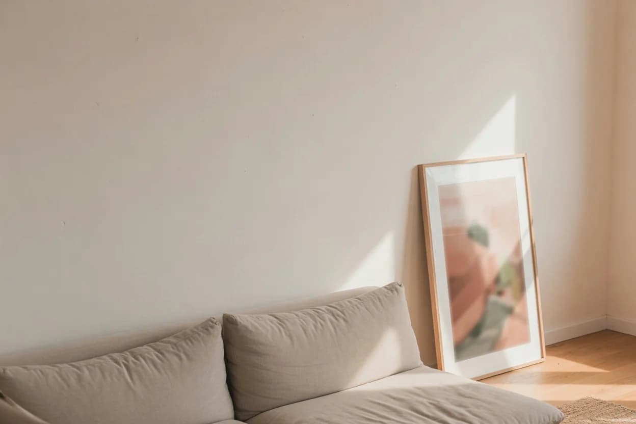
This method has a clear failure point. If your room is entirely neutral (white walls, beige sofa, jute rug, no art), there's nothing to extract from. You're not pulling accent color; you're introducing it. The fix is to choose your anchor object first. Buy the rug. Hang the art. Then extract. Without an anchor, accent color selection becomes pure preference, and preference-based decisions in a neutral room tend to default to whatever looked good on Instagram that week. That's not a method. That's a coin toss.
Test Before You Commit
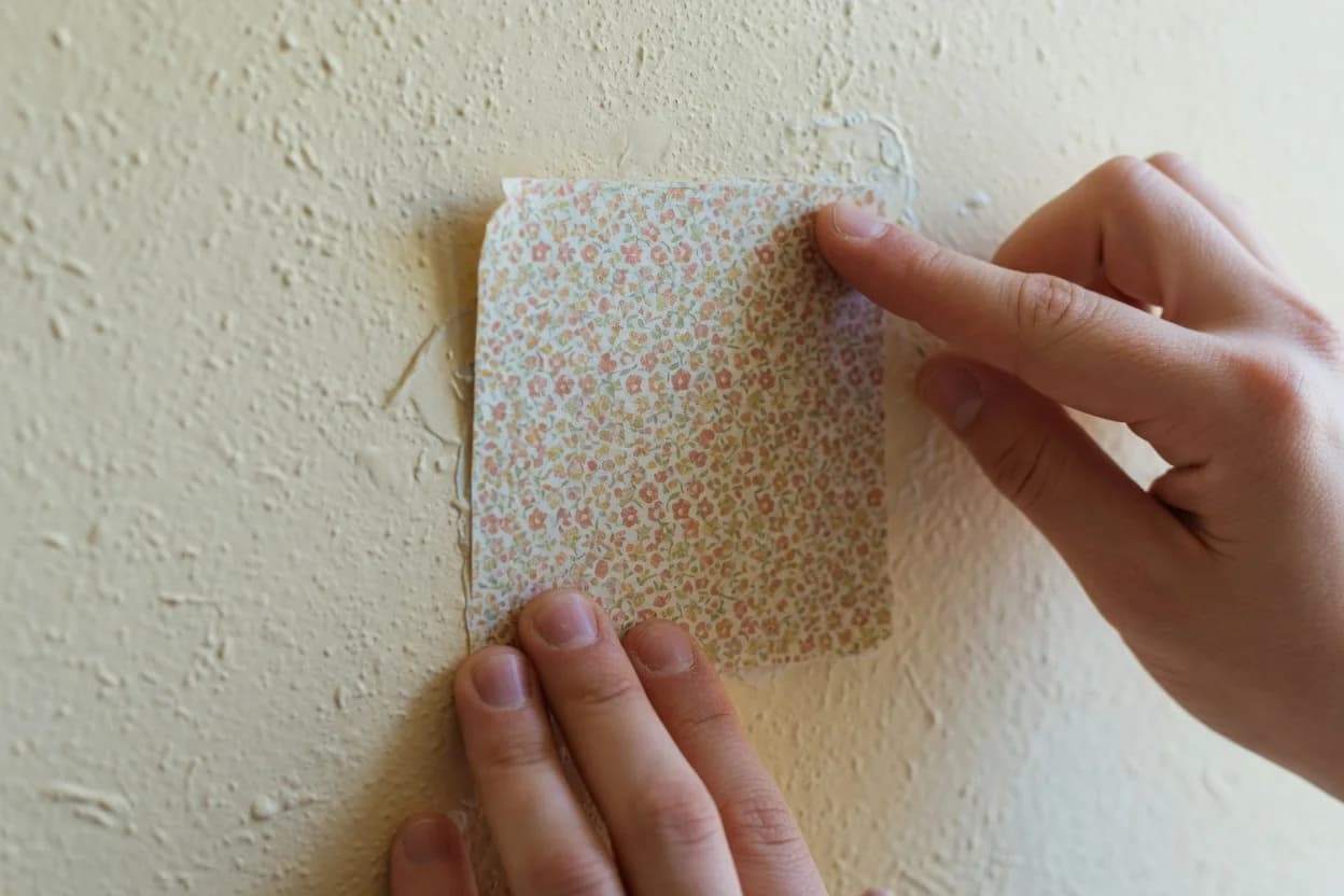
Once you've identified a candidate accent color, test it before committing to $200 worth of pillows and pottery. The test costs almost nothing. Buy one item (a single pillow cover, a small ceramic vase, a fabric swatch) in the candidate color. Place it in the room at the time of day you use the space most.
Evening light skews warm. North-facing rooms drain saturation, sometimes dramatically. Benjamin Moore advises testing paint colors under different lighting conditions before committing, and the same principle applies to every piece of decor you bring in.[3] A rust that looked rich at the store can turn muddy by 6 PM when you're comparing it against the actual sofa.
Move your test object around. Put it on the sofa. Hold it against the rug. Set it on the side table. The color should read as itself, not as a distorted version, from every angle and under every light source in the room. If the color shifts dramatically between day and evening, it's the wrong color. A good accent color holds its identity across conditions. It doesn't need to look identical under every bulb, but it must remain recognizable as the same hue.
Torn between two shades? Buy the darker one. In small doses (pillows, art frames, candle holders), a slightly deeper accent reads as intentional. A washed-out version reads as a mistake.
Where to Repeat Your Accent Color (And Where to Stop)
An accent color repeated in three to five places reads as deliberate. Fewer than three and it looks accidental, like you bought one pillow and gave up. More than five and the room starts to feel themed, which is a fast track to a space that photographs well but feels like a hotel lobby.
The placements that deliver the most impact per dollar:
- Throw pillows. Two pillows in your accent color, mixed with neutral pillows for relief. The accent pillows should sit forward in the arrangement, not buried in back.
- Art. Your accent color should appear somewhere in at least one piece of wall art. If existing art doesn't contain it, a small framed print or textile piece costs less than replacing everything.
- A small object at eye level. A vase, a candle, a book stack with a spine in the accent color. This pulls the eye up and distributes the color vertically, which prevents the "pillows floating in a void" problem.
- A throw blanket. Folded over the arm of a chair or sofa corner. Texture matters: if pillows are smooth cotton, choose a chunky knit or woven throw in the accent shade.
What you don't need: accent curtains, an accent chair, accent lampshades, accent coasters. Placing the color in more than five locations dilutes its impact. The goal is repetition that feels like discovery, not distribution that reads like a checklist.
Stop when someone walking into the room could identify the accent color without being told, but couldn't immediately count every instance of it. That's the sweet spot.
If your room has a distinct color already living in a rug, art piece, or sofa, extract your accent from that item using the rarest-color rule and test it in evening light before buying multiples. If your room is entirely neutral with nothing to pull from, pause the accent color decision and buy one anchor object first. The rug is the easiest starting point because it sits under everything and typically contains three to six colors. If you've already bought accent pieces and they're not working, remove everything, identify the single best-existing color in the room, and reintroduce only items that contain that color. The room that looks designed is the one where the colors were already present, not the one where they were imported.