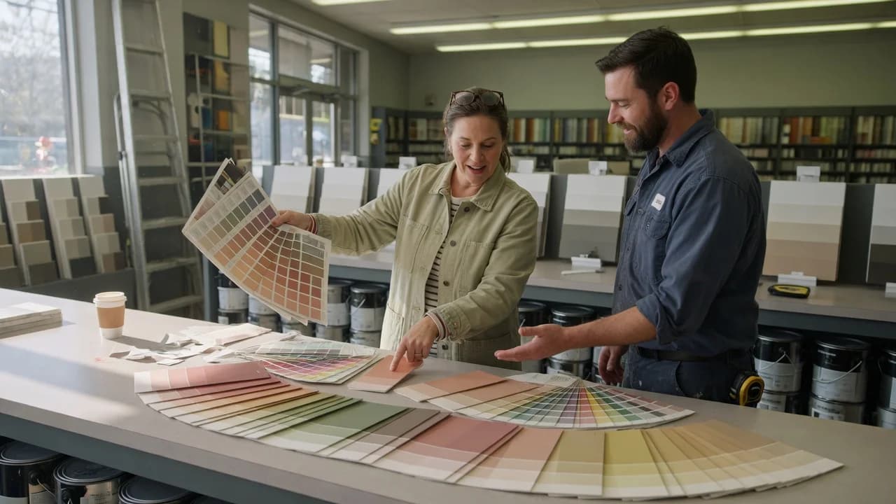
Since LED bulbs became the default in American homes, the old advice about checking paint chips in "natural light" has quietly stopped working. Cool-white LEDs push beige toward green; warm bulbs make gray read beige; the chip you loved at the store sat under 4000K fluorescent—light your house doesn't have. Paint undertones are why a color that looked perfect on the chip reads wrong on the wall, and they're the difference between a room that feels finished and one you'll repaint in six months. Most people test colors in isolation, under one light source, against nothing. Your eye needs contrast to perceive undertone; without it, every gray looks flat and every white looks, well, white. But the room imposes its own light direction, its own fixed finishes, its own reflections. When those conditions pull an undertone forward that you never saw coming, you don't have a subtle color shift—you have a wall you can't stand to look at.
What Undertones Actually Are
Every paint color is a mix of pigments. The dominant pigment gives you the mass tone—what you'd call the color if someone asked. A gray looks gray. A beige looks beige. That surface-level read is what sells the paint chip, and it's what disappears the moment the paint hits your wall under your light.
The undertone is the secondary pigment that surfaces under specific conditions. Sherwin-Williams describes it as the subtle hue that distinguishes one color from others in its family.[1] Warm undertones come from red, orange, and yellow pigments. They make a room feel close, comfortable, alive. Cool undertones come from blue, green, and violet. They make a room feel clean, calm, pulled back. Neither is better. They just do different things to a space.
Benjamin Moore notes that most paint colors use two or more pigments, and the undertone emerges when one pigment dominates the mix.[2] A white with more yellow than blue reads warm. That same white formula shifted toward blue reads cool. On a paint chip in the store aisle, both look white. On your wall at 6 PM, one looks creamy and the other looks icy. Same mass tone. Radically different rooms.
Here's what trips people up: undertone isn't a defect the paint company is hiding. It's the physics of color mixing. Every neutral—every gray, beige, greige, taupe, and white—has an undertone. There's no such thing as a neutral without one. The question isn't whether your color has an undertone. It's which one, and whether your room will amplify it or neutralize it.
Why Paint Chips Lie to You
Paint chips are designed for the store, not your house. The lighting in a Benjamin Moore or Sherwin-Williams showroom runs around 3500K to 4000K—bright, balanced, and nothing like the 2700K warmth of your living room at night or the cool north light in your hallway. Benjamin Moore explicitly advises testing paint samples in the actual room under its real lighting conditions for this reason.[2] The chip is a starting point, not an answer.
But the bigger problem is isolation. You're holding one chip. Your eye adapts. Without a reference point, your brain neutralizes the subtle color bias. That's why a gray with a green undertone looks like a clean gray on the rack—and like sage on your wall next to oak floors.
Undertones aren't hidden; they're just waiting for the right comparison. Place two similar grays side by side on white paper and suddenly one is blue, one is green, one is purple. You couldn't see it alone. The comparison creates the contrast your visual system needs to discriminate. This isn't a design opinion. It's how human color perception works.
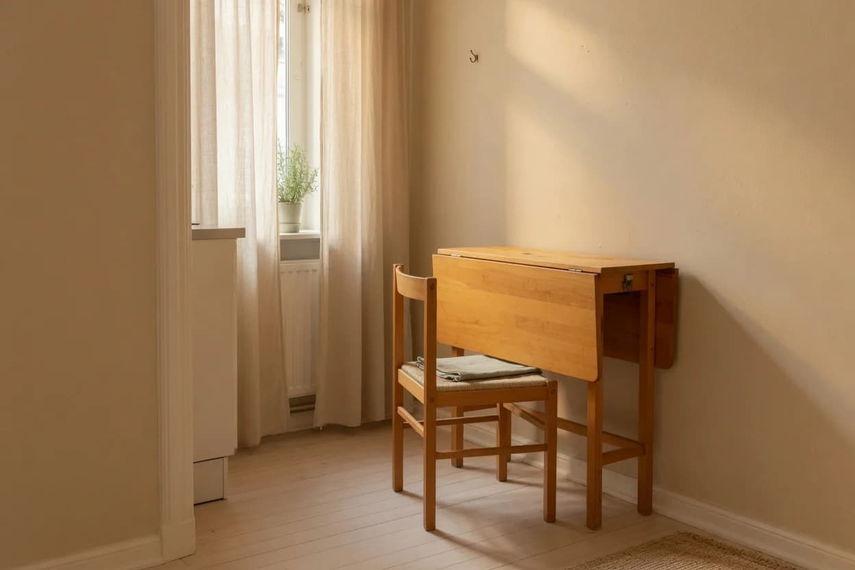
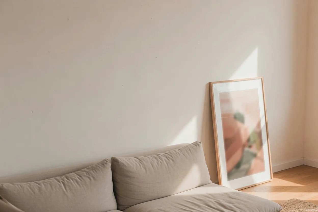
Light direction compounds everything. North-facing rooms in the US receive cool, indirect light all day. Any blue or green undertone in your paint gets amplified. South-facing rooms flood with warm light, pulling yellow and red undertones forward and washing out cooler colors. East-facing rooms run warm in the morning and flat by afternoon. West-facing rooms are the opposite—dull until late afternoon, then saturated with golden warmth that can turn a neutral beige visibly orange by 5 PM.
That understates it. The light isn't just affecting the color. It's selecting which undertone becomes the dominant read. You didn't pick the wrong gray. You picked a gray whose undertone your room decided to broadcast.
How to Expose Undertones Before You Paint
You need three things: a white reference, comparison chips, and a large sample in your actual room. None of this is complicated. It just requires refusing to trust a single chip viewed alone.
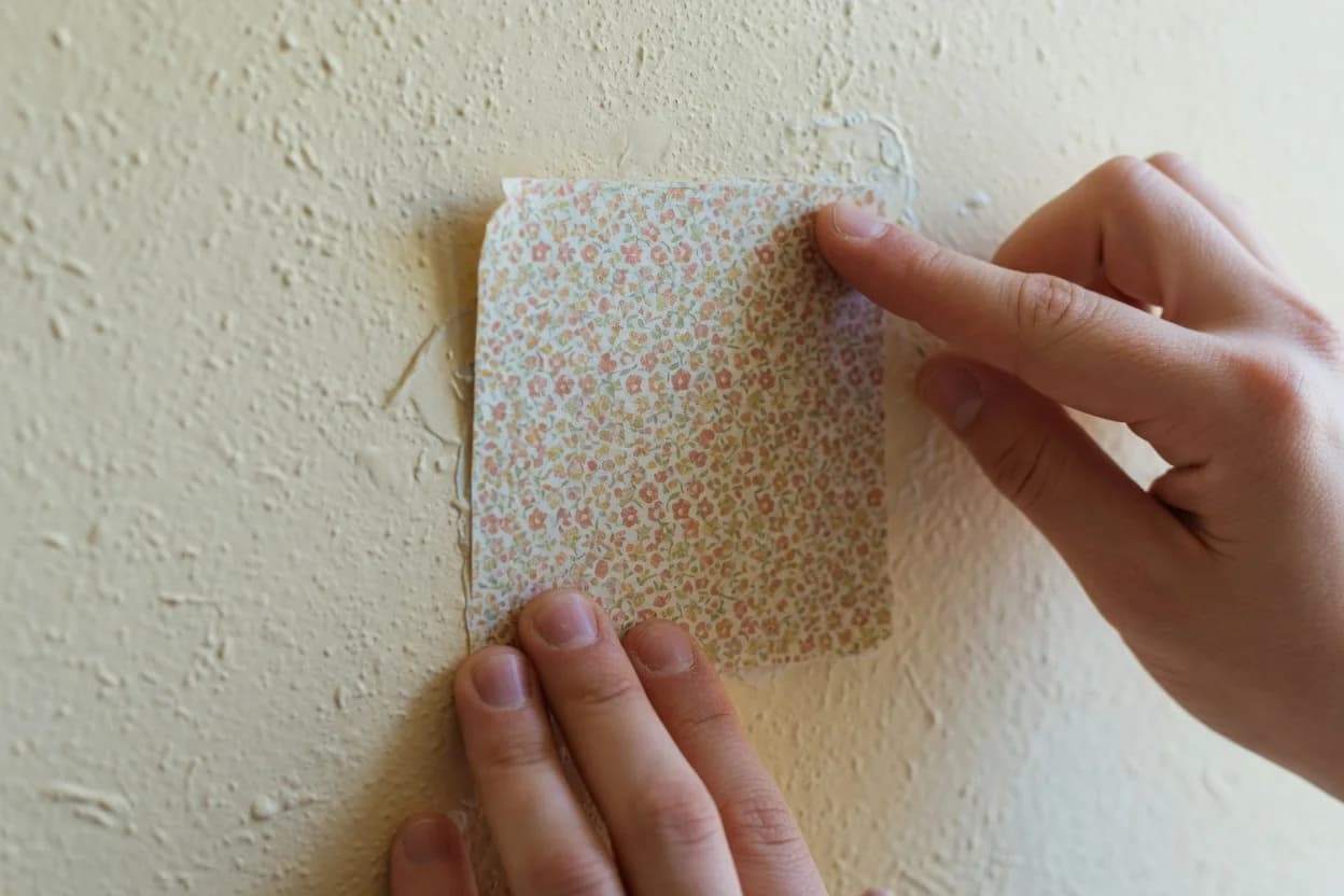
Start with the white paper test. Place your paint chip on a sheet of plain white printer paper in indirect daylight. The pure white creates a contrast that forces the undertone to surface.[3] A gray that looked neutral at the store suddenly reads blue, green, or violet. A white reveals yellow, pink, or gray leanings. This takes thirty seconds and costs nothing. Do it before you buy anything.
Then compare chips horizontally. Don't fan them out. Lay three or four similar colors flat on white paper next to each other. Your eye registers the differences instantly. The warmest chip makes the others look cool by comparison. The greenest gray exposes the blue-gray next to it. Sherwin-Williams recommends this exact technique: the mid-to-darker colors on a paint strip reveal the undertone family the lighter shades belong to.[1] A light gray whose darkest strip-mate is visibly green will pull green on your wall too.
Finally, buy sample pots of your top two or three choices. Paint swatches at least two feet square on multiple walls in the room—the window wall, the opposite wall, and the wall you face most. Check them at 9 AM, noon, 5 PM, and 9 PM with your actual lighting on. Davis Painting recommends living with samples for at least two days and checking in different weather—cloudy days versus sunny days shift everything.[3] The 5 PM check matters most. That's when most American households have mixed natural and artificial light, which produces the most surprising undertone shifts.
Quick-Reference Summary: White paper test first (30 seconds, free). Horizontal chip comparison second (5 minutes). Sample pots on three walls third (48 hours). The 5 PM mixed-light check is your decision point.
Now, one condition where this method weakens. Rooms with two dominant fixed elements that pull in opposite directions—say, honey-oak floors reflecting warm orange and black granite countertops pulling cool—create a color conflict no single paint can fully resolve. The warm floor throws orange light onto the lower wall. The cool stone pulls it back near the counters. Your wall color shifts depending on where you're standing. In that situation, pick the undertone that harmonizes with the largest surface area in the room (usually the floor) and accept that corners will read differently. Or paint the room a clean white and let the finishes carry the color.
The Decision That Rewards the Work
You can drive yourself crazy chasing the perfect undertone. Don't. The goal isn't finding a color with no undertone—that color doesn't exist. The goal is controlling which undertone the room amplifies.
Here's what that looks like on a Saturday morning. You've done the white paper test and narrowed to two grays, one warm (brown/purple base), one cool (blue/green base). Your room faces north. You paint two-foot squares on three walls and check them at 9 AM, 2 PM, and 8 PM over two days.
The warm gray reads warmer than expected in north light—which is the point. It counterbalances the cool cast and prevents the room from feeling cold. The cool gray looks drab, possibly institutional. That's your answer. Buy the warm gray. If the room faces south, run the same test. The cool gray neutralizes the warm light. The warm gray may read yellow or peach by late afternoon. Buy the cool gray.
What happens if you skip this? You commit to a gallon based on a chip. You roll it on a Saturday. By Sunday evening you're googling "how to fix paint color too green." A repaint costs another $50 to $80 in paint and a full weekend. The sample pots cost $5 to $8 each. That math doesn't need a calculator.
Check the LRV while you're at it—Light Reflectance Value, printed on the back of most major-brand paint chips. It's a 0-to-100 number telling you how much light the paint reflects. Two colors can share an LRV of 60, one warm beige and one cool gray, and read completely differently in the same room. LRV tells you brightness. Undertone tells you character. You need both numbers before you buy.
Buy the sample pots. Paint the swatches. Check them at 5 PM. That's the step that separates a room you love from one you repaint. Everything else—the white paper test, the LRV check, the comparison chips—makes that step faster and smarter. But the sample on your actual wall, under your actual 5 PM light, is the one decision that counts. Skip it and you're guessing. And guessing with a gallon of paint costs more than you think.