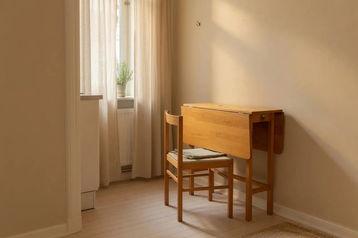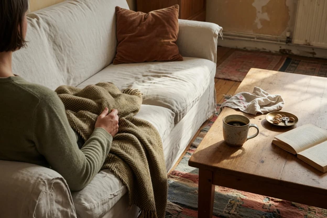
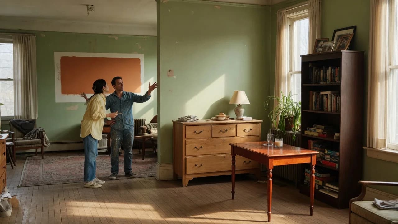
Standard decorating advice says to pick a neutral wall color and let your furniture do the talking. When your furniture is a collection of hand-me-downs in oak, cherry, and walnut, that advice makes the chaos permanent. You're not picking a backdrop for a curated set. You're trying to absorb the visual noise of three different decades, finishes, and wood species into something that reads as intentional rather than accidental.
The neutral you choose matters more than any single piece of furniture in the room. Get it wrong: go too cool and your grandmother's cherry dresser looks like a sunburn. Go too white and every scratch and mismatched leg shouts for attention. The neutral has to do real work here.
There's a tension here nobody tells you about at the paint store. The neutrals that look best in model homes and Pinterest photos are often the worst possible choices for a room full of warm, mismatched hand-me-downs. Pure white walls, cool gray, even that trendy greige everybody recommends, each can amplify the clash instead of quieting it.
The answer turns on undertone, not on what's popular. And the rule is simpler than you'd expect.
Why Most Neutral Advice Works Against You
Pick any "best neutral paint color" list and you'll see the same suspects: Pure White, Agreeable Gray, Classic Gray, maybe a pale greige if the list is feeling adventurous. Those colors work beautifully in rooms where the furniture was bought to coordinate. In a room with a golden-oak hand-me-down dresser, a cherry side table from your aunt, and a dark-walnut bookcase from a garage sale, they fail for a specific reason.
The failure has nothing to do with the colors themselves. It's about temperature conflict. Most hand-me-down furniture in American homes skews warm: honey oak, cherry, walnut, mahogany, even that orange-y pine from the 1990s. These woods carry red, yellow, and orange undertones. A cool gray wall sits opposite them on the color wheel. Instead of neutralizing the differences between pieces, the gray creates a temperature contrast with every piece simultaneously. The room doesn't read as unified; it reads as furniture floating in a chilly void.
Pure white does something different but equally unhelpful: it creates maximum contrast, which makes every piece look darker and more distinct. A white wall next to dark walnut says look at this dark thing. Next to light oak, it says look at this light thing. The differences between your pieces become the main visual event.
What you need is a neutral that shares an undertone with your furniture rather than one that sits in opposition to it. Not the room's average undertone. The warmest one.
Match the Warmest Piece, Not the Average
You're not picking a neutral to match the room; you're picking a neutral to absorb the differences.
That reframes the entire decision. Instead of asking "what color goes with everything," ask "what color makes the warmest thing in the room look like it belongs." Here's why.
Take a room with three pieces: a light-oak coffee table (neutral-warm), a cherry end table (definitely warm), and a walnut bookcase (warm but darker). If you pick a neutral matched to the average, say, a balanced greige, the oak looks fine, the walnut looks fine, and the cherry sits there radiating orange-red heat that the wall does nothing to settle. The warmest piece becomes the outlier, and outliers draw the eye.
If you pick a neutral matched to that cherry instead, a warm beige or a warm greige with visible yellow or red undertone, the cherry settles into the background. The oak and walnut, being already closer to neutral, adjust easily. The warmest piece sets the temperature floor. Everything above it falls into place.
That framing misses something. You're not actually matching the warmest piece; you're choosing a neutral warm enough that the warmest piece stops reading as an outlier. The distinction matters when you're holding swatches: match too precisely to the cherry dresser and the wall starts reading pink-beige. You want slightly warmer than neutral, not a color match to the furniture.
This is why Sherwin-Williams Accessible Beige (SW 7036) works so reliably in rooms with mixed-wood hand-me-downs. At LRV 58, it sits in the mid-light range, bright enough to keep a room from feeling heavy, but deep enough to read as a real color rather than an off-white. Its undertone is unambiguously warm: a beige-yellow over a muted gray base.[1] That warmth absorbs the red-orange tones in cherry and mahogany while still reading as neutral against lighter oaks.
Benjamin Moore Revere Pewter (HC-172) takes a slightly different approach. At LRV 55, it's a touch deeper, with a taupe undertone that reads warm without tipping yellow.[2] Its warmth is more brown than beige, which makes it a better choice when your warmest piece is walnut or mahogany rather than cherry or golden oak. In rooms with limited natural light, expect it to read significantly darker than the swatch suggests.
Interior designers consistently advise matching undertones rather than wood species when coordinating mixed furniture: warm with warm, cool with cool.[3]
The right neutral acts as a bridge, but only when the undertone aligns with your furniture's temperature.
| Paint Color | LRV | Undertone | Best When Warmest Piece Is |
|---|---|---|---|
| SW Accessible Beige 7036 | 58 | Warm beige-yellow | Cherry, golden oak, honey pine |
| BM Revere Pewter HC-172 | 55 | Warm taupe-brown | Walnut, mahogany, dark stained oak |
| SW Agreeable Gray 7029 | 60 | Balanced greige | Only when all pieces are neutral-toned |
| BM Edgecomb Gray HC-173 | 63 | Soft warm greige | Mixed light-to-medium warm woods |
Agreeable Gray lands on nearly every "best neutral" list, but notice: it earns a place here only when every piece in the room is already neutral-toned. That's a narrower use case than most articles admit.
One condition where this whole approach weakens: laminate furniture with printed wood grain. If your hand-me-down is particleboard with a photographic veneer, the undertone matching rule still applies mathematically, but the material itself creates a different problem. Printed grain has no depth, no real wood undertone to anchor to. In those cases, the wall color helps less than you'd hope. Paint the laminate piece, slipcover it, or replace it before investing in gallons of the perfect neutral. The wall color strategy works hardest when there's real wood to work with.
How to Test Before You Paint
You can't evaluate a neutral from a swatch on your phone. Phone screens strip undertone. Store lighting lies. The only test that matters is the one in your actual room, next to your actual furniture, at the times of day you actually use the space.
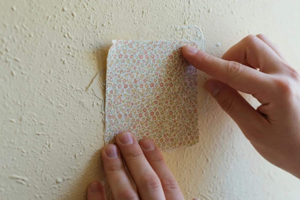
Buy sample pots, not peel-and-stick sheets, which don't capture the color's behavior on your wall texture, and paint at least a two-foot square on two different walls. One that catches morning light, one that doesn't. Live with those squares for 48 hours. Check them at 8 AM, at noon, under your lamps at 9 PM. A color that reads perfect under midday sun can turn greenish or gray under warm LED bulbs, and the last thing you want is a neutral that only works for four hours a day.
While you're at the paint store, grab the LRV number for any color you're considering. Most US paint brands print it on the back of the swatch or list it on their website. For rooms with mixed hand-me-downs, stay between 55 and 63. Below 55, the color starts reading as medium-dark, which can make a small room feel closed in. Above 63, you're in near-white territory, where contrast takes over and the unifying effect diminishes. The sweet spot gives you enough pigment to hold the wall without competing with the furniture.
And here's a practitioner trick most guides skip: test your sample square against the back of the warmest piece, not the front. The back of a dresser or the inside of a cabinet door usually shows the truest, least-sun-bleached version of the wood's undertone. Match to that, not to the faded front.
What Happens If You Skip This
If you paint the room a cool gray or a pure white and call it done, here's what you'll notice in about two weeks: the room will feel off in a way that's hard to name. Nothing will look wrong individually. But the space won't settle. Your eye will keep moving from piece to piece, unable to find a place to rest. That's the temperature conflict at work: not a glaring error, but a low-grade visual unease that makes you not want to spend time in the room.
The fix at that point is expensive: repaint, or replace furniture. A gallon of quality paint runs $40 to $70 at US retailers. Sample pots cost $5 to $8. The asymmetry is brutal. The cost of getting it right the first time is a few sample pots and 48 hours of patience. The cost of getting it wrong is doing the whole room twice.
Not every problem in this scenario is a paint problem. If your hand-me-downs include a genuinely ugly piece, not mismatched, but ugly, no neutral will redeem it. Paint it. If the room has four or more distinct wood species competing for attention, a single wall color can only do so much. At that point, a large neutral rug in a warm tone does some of the absorption work that the walls can't reach. Rugs sit under the furniture, which puts them in a better position to visually tie pieces together than wall color alone.
What this article is not about: painting all your furniture to match. That's a valid strategy for some pieces, but it's a different project entirely, more labor, more prep, and a fundamentally different aesthetic result. If one or two pieces are the problem, painting them white or black can remove them from the undertone equation. If the whole collection is the problem, start with the wall color and a rug before you pick up a paintbrush for the furniture.
If your warmest hand-me-down piece leans cherry, golden oak, or honey pine, start with Sherwin-Williams Accessible Beige. Its beige-yellow undertone absorbs those red-orange tones without reading yellow on the wall.
If your warmest piece is walnut, mahogany, or a dark stain, shift to Benjamin Moore Revere Pewter. Its taupe undertone grounds darker woods without pulling cool.
If you can't identify the warmest piece or the undertones all look the same to you, default to Accessible Beige. Its LRV of 58 and lighting stability make it the more forgiving option across a wider range of hand-me-down furniture.
Buy the sample pot. Paint the square. Wait 48 hours. That sequence costs under $10 and prevents the $200 mistake of repainting a room that never had a chance.