Interior designers will tell you the same thing about studio apartments, and most people ignore it because it sounds backward: place your rugs before you place your furniture. A combined living and dining area in 450 square feet doesn't fail because you chose the wrong sofa. It fails because nothing on the floor tells your eye where the living room stops and the dining area begins.
The gap between what makes a studio feel anchored and what most renters actually do is a matter of sequence, not budget. You can spend two thousand dollars on furniture and still have a room that reads as one undifferentiated box if the rugs are too small and the lighting treats every square foot equally. Flip the order — floor first, then light, then furniture — and a two-hundred-dollar rug does more anchoring than a designer sofa ever could.
Put more precisely: the rug does not decorate the zone. The rug is the zone. Everything you place on top of it inherits that zone's identity. That's why a correctly sized rug under your dining table does more separation work than physically moving the table three feet farther from the sofa.
Three variables determine whether your living-dining combination holds or collapses: rug dimensions in inches, pendant height above the dining surface, and the proportion of your sofa to the wall behind it. None of these are matters of taste. They're matters of measurement, and the ranges are narrower than most design blogs suggest. Open your floor plan right now and find these three numbers. If you can't name them, you're guessing, and guessing is why your studio still feels like one big room.
Start With the Floor: Rug Sizing That Actually Works
Your studio doesn't need walls; it needs a floor plan drawn in rugs and light.
The most common mistake in a studio living-dining setup is buying one large rug and centering it in the middle of the room. It feels logical — cover as much floor as possible, unify the space. But one oversized rug erases boundaries. It tells the eye that everything sitting on it belongs to the same room, which is exactly the problem you're trying to solve.
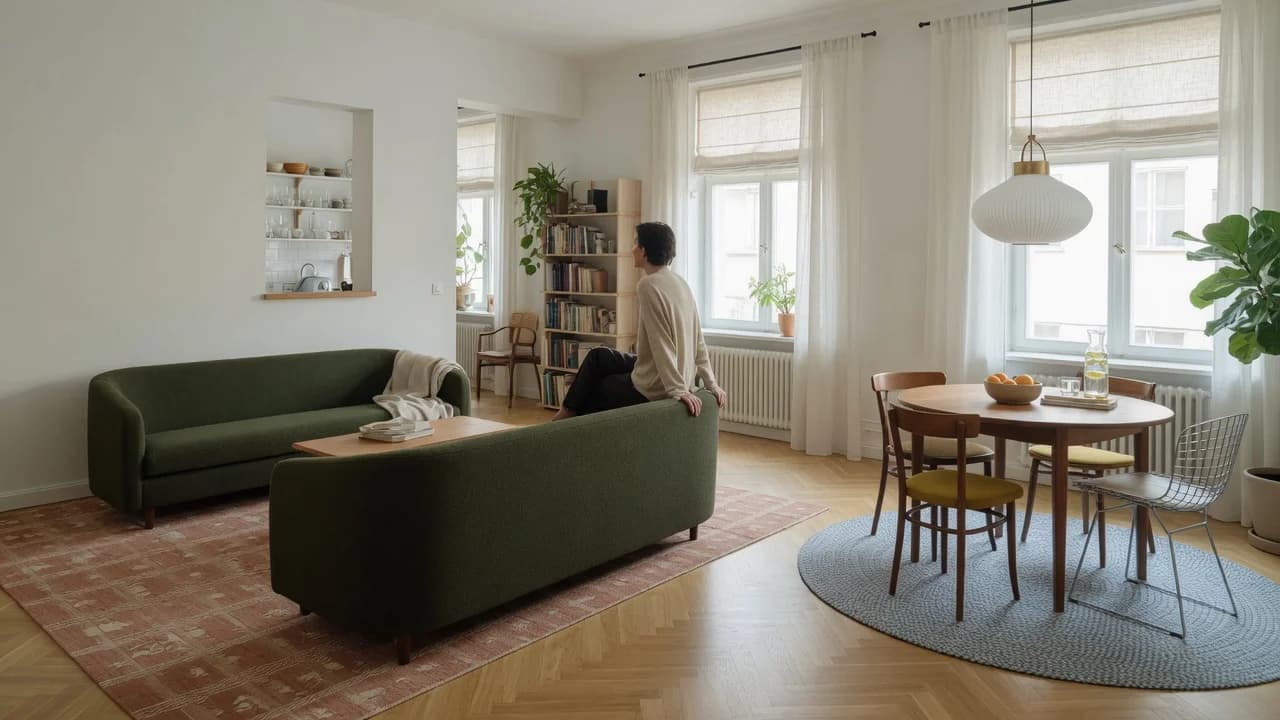
The correct approach is two rugs with a deliberate gap between them. The living zone gets the larger rug: 8×10 feet minimum, 9×12 preferred if your sofa is over 80 inches wide. The dining zone gets a 5×8 or 6×9, sized so that when chairs are pulled out to sit, all four chair legs remain on the rug. A common guideline among design practitioners: the dining rug should extend at least 24 inches beyond the table edge on all seated sides.
The gap between rugs does more work than either rug alone. Leave 12 to 18 inches of bare floor between the living rug and the dining rug. That stripe of visible floor creates the visual boundary. When rugs touch, the zones blur and you've paid for two rugs that function as one.
Sizing is non-negotiable because proportion, not pattern, creates the anchor. A 5×7 rug under a standard 6-foot sofa is a postage stamp — it shrinks the zone visually rather than defining it. A 6×9 under the same sofa starts to anchor. The 8×10 is where the living zone actually locks into place. According to Apartment Therapy's coverage of designer practices, the Two-Thirds Rule applies here: your sofa should sit on a rug roughly two-thirds the sofa's length with breathing room on all sides, which in practice means the 8×10 or larger for any full-size sofa.[1]
For the dining rug specifically, the test is simple. Pull out a chair to sitting position. If the back legs fall off the rug, the rug is too small. This happens every time with 4×6 rugs under 36-inch round tables, which is why 5×8 is the functional minimum for any dining setup that seats more than two. And if your chairs pull out 20 inches from the table edge and the table itself is 36 inches wide, your rug needs at least 76 inches of width (36 plus 20 plus 20). A 5×8 at 60 inches wide fails that math. A 6×9 at 72 inches gets close.
The sizing ranges worth memorizing:
| Zone | Minimum Rug | Recommended | Why |
|---|---|---|---|
| Living | 8×10 ft | 9×12 ft | Front legs of all seating on rug |
| Dining | 5×8 ft | 6×9 ft | Chair legs stay on rug when pulled out |
These numbers come from repeated observation across hundreds of small-space layouts. The minimums are not aesthetic preferences. They're functional thresholds below which the zone dissolves.
Hang Light Before You Place Chairs
Lighting is the step most studio guides mention in passing and never quantify. But a pendant hung at the wrong height over a dining table is worse than no pendant at all. Too high, it disappears into the ceiling. Too low, it blocks sightlines and makes every meal feel like an interrogation.
The standard for dining pendants in US homes is 30 to 36 inches from the bottom of the fixture to the table surface.[2] At 30 inches, the light creates an intimate pool that says this is where we eat. At 36 inches, the effect is more open and works better for tables that double as workspaces during the day. Above 36 inches, the pendant stops anchoring the dining zone and becomes ambient light that happens to be near the table.
Most studios have 8-foot ceilings. A standard dining table sits at roughly 30 inches off the floor, leaving 66 inches of vertical space. A pendant hung 32 to 34 inches above the table occupies the middle of that volume and visually compresses the dining area into its own room. Your eye hits the pendant before it reaches the sofa or the bed, and the boundary registers instantly.
For renters who cannot hardwire a ceiling fixture, a plug-in swag pendant with a cord management hook is the workaround. IKEA's KVARTAL track system runs under sixty dollars and supports lightweight pendants. Run the cord along the ceiling, drop it above the table, and plug it into the nearest outlet. The visual effect matches a hardwired fixture, and you can remove it in twenty minutes when the lease ends.
Bulb temperature matters here. The dining pendant should use a 2700K to 3000K warm bulb. The living zone floor lamp should use the same range. But the pendant should be dimmer-controlled, because dropping the light level at dinner signals the transition from this is a room where things happen to this is where we sit and talk. A twenty-five-dollar plug-in dimmer from any hardware store does this without touching the apartment's wiring.
Which means three dining-zone lighting checks: pendant bottom between 30 and 36 inches above the table, bulb at 2700-3000K, and a dimmer in the circuit. Skip any one of them and the anchoring weakens.
The Sofa Is Your Best Room Divider
Once the rugs define where zones begin and end, and the pendant anchors the dining area from above, the sofa locks in the boundary from the side. And most studio layouts get this wrong.
The sofa should float with its back to the dining zone, not pushed against a wall. When a sofa faces the living area and turns its back on the dining table, it functions as a three-dimensional wall that doesn't block light. The 30- to 36-inch walkway behind the sofa becomes the transition corridor between zones. The sofa's mass registers as a deliberate boundary rather than a piece of furniture that happens to be in the middle of the room.
The Two-Thirds Rule governs sofa size here. Your sofa should occupy roughly two-thirds of the wall or visual boundary it anchors, never the full length. A 12-foot wall calls for a sofa around 8 feet wide, roughly 84 to 96 inches. A sofa that stretches wall-to-wall kills the breathing room that makes a zone feel intentional. Too small — under two-thirds — and the zone reads as provisional, like furniture waiting to be arranged.
For studios under 400 square feet, an apartment-scale sofa in the 66- to 75-inch range works. But the Two-Thirds Rule still applies. Measure the width of the living zone's rug, not the full room. If the living rug is 8 feet wide (96 inches), a 66-inch sofa leaves roughly 15 inches on each side. That's the minimum for a side table or floor lamp. Less than that and you'll feel it every time you reach for a drink.
The 18-inch clearance between sofa and coffee table is another number that feels tight on a tape measure and exactly right in practice. At 18 inches, you can reach your coffee without straining. At 24 inches, you're leaning forward. At 12 inches, you're squeezing past. Mark it with tape and do not fudge it.
So. Rugs down. Light hung. Sofa floating. The living zone now has a floor, a ceiling, and a wall — none of them made of drywall.
The Dining Table That Earns Its Square Footage
The dining table in a combined living-dining studio has to justify every square foot it occupies, because those square feet are borrowed from the living zone, the walkway, or both. A table that's too wide for its designated rug creates a bottleneck. Too small, and the dining zone reads as an afterthought, not a room.
A round pedestal table of 36 to 42 inches is the default recommendation for studios above 400 square feet. The pedestal base eliminates corner legs that trap chairs and shins, and the round shape lets traffic flow around it without sharp corners. It seats two for daily meals and four with an extendable leaf. I'd start with a 36-inch tulip-style table if the dining rug is 5×8; step up to 42 inches if you have a 6×9.
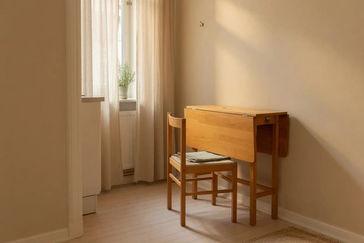
For studios under 400 square feet, or layouts where the dining zone shares floor space with a walkway, a drop-leaf or wall-mounted folding table is the better call. The IKEA DANDERYD seats two folded and four extended, and at 29 inches wide when collapsed, it can live against a wall as a console between meals. Wall-mounted options fold completely flat, restoring the floor entirely when dinner is over.
The critical measurement for dining clearance comes from the National Kitchen & Bath Association's planning guidelines: a minimum of 30 inches of walkway clearance around the dining table, and 24 inches of width by 18 inches of depth for knee space per seated diner at a standard 30-inch-high table.[3] In a studio, 36 inches of clearance on the primary aisle side is more comfortable, but 30 inches is the functional floor. If you cannot maintain 30 inches between the dining chair in its pulled-out position and the nearest obstacle — sofa back, wall, kitchen counter — the table is too large for that spot.
One configuration worth avoiding entirely: the bar-height table with stools. The 42-inch surface height breaks the sightline across the studio in a way that standard 30-inch dining height doesn't. It creates a visual wall where you probably don't want one, and it makes the dining zone feel like an extension of the kitchen rather than a distinct room.
Quick pre-purchase checklist: measure the table width collapsed and extended, confirm the rug underneath is at least 24 inches wider than the table on all seated sides, and walk the 30-inch clearance path before you unbox anything.
When Your Studio Shape Changes the Rules
Everything above assumes a rectangular or L-shaped studio with enough length to create distinct zones separated by a walkway. A square studio under 350 square feet breaks that assumption, and the two-rug strategy comes apart.
The problem in a compact square layout is floor fragmentation. Two rugs with a gap between them in a 15-by-15-foot room leave you with three small islands of floor — living rug, bare gap, dining rug — none of which feels substantial. Instead of defining zones, the rugs create visual clutter. The gap reads as dead space, not a boundary.
In this configuration, use one larger rug for the living zone — 6×9 or 8×10 if the room allows — and define the dining area through lighting and furniture placement alone. A pendant hung at 30 inches above a small round table, positioned near the kitchen wall, creates enough separation without a second rug. The overhead light defines the zone vertically. The table's proximity to the kitchen wall defines it horizontally. It's not as crisp as the two-rug method, but it's better than fragmented floor space.
The long narrow studio, often found in older buildings, calls for a different adjustment. Here the kitchen lines one short wall and the living space stretches away from it. The two-rug strategy works, but the zone order flips. The dining area should sit between the kitchen and the living zone, not parallel to it. The sofa faces the long wall rather than the kitchen, and its back creates the boundary between dining and living. The dining rug, 5×8, sits perpendicular to the kitchen counter. The living rug, 8×10, sits parallel to the long wall. This creates a progression — kitchen to dining to living — that reads like moving through rooms rather than across one.
If you ignore these shape-specific adjustments and apply the same formula to every layout, you get a studio that fights its own geometry. The anchor points hold. The proportions don't. And you'll rearrange the furniture twice a year without ever fixing what's actually wrong.
Conclusion
If your studio is rectangular or L-shaped and over 350 square feet, anchor the living zone with an 8×10 or 9×12 rug, hang a pendant 30 to 36 inches above the dining table, float the sofa with its back to the dining area, and leave 12 to 18 inches of bare floor between rugs. The zones will hold, and the studio will read as two rooms despite having no wall between them.
If your studio is square and under 350 square feet, skip the dining rug entirely. Use one 6×9 or 8×10 rug for the living zone, a pendant at 30 inches above a small round table near the kitchen wall, and let the light do the anchoring that a second rug cannot deliver.
If you're unsure which camp you fall into, start with the rug. Tape out the living zone dimensions on the floor and live with the taped boundary for three days. Measure the walkway gap between your hypothetical living rug and where the dining table would sit. If you cannot maintain at least 30 inches of walking clearance, you're in the compact-square camp. Use the one-rug strategy.
The consequence of ignoring this sequence — rugs first, then light, then furniture — is not a studio that photographs badly. It's a studio where the sofa faces the right direction but the proportions are off by a foot, and you feel it every time you sit down to eat in what still feels like your living room. The fix isn't more money or a bigger apartment. It's getting the order right.