
You've packed up the Santa figurines and stripped the tree. So why does the living room still feel like December 26th—not January, not winter, just...after?
The standard advice on keeping winter decor up after the holidays tells you to remove the obvious Christmas items, keep the neutral pieces, and layer in cozy textures. Here's what it misses: red anywhere in the visual field re-Christmasifies everything around it. A bare pine garland reads as winter until your eye lands on a red candle sitting three feet away. Suddenly the garland looks like unfinished Christmas, not intentional winter.
You've already tried keeping the neutral stuff and ditching the obvious Christmas tchotchkes, and the room still feels off—but you can't pinpoint why.
The Real Thing Making Your Decor Look Leftover
Ask an interior designer what separates winter decor from Christmas leftovers, and they won't talk about items first. They'll talk about color relationships. Wendy Glaister, CEO of Wendy Glaister Interiors, puts the priority on an immediate post-holiday edit that clears surfaces and removes anything with a Christmas or Hanukkah motif, then rebuilds from a neutral base.[1]
What trips people up isn't the Santas. You know to pack those. The trap is the red accent that doesn't register as Christmas on its own—a cranberry throw, a burgundy vase, the pillow you bought in November and forgot was part of a holiday collection. Your brain processes color relationships faster than individual objects. Red next to green equals Christmas. It's automatic and nearly impossible to override through sheer intention.
That's why the item-by-item approach fails. You'll evaluate each piece in isolation, decide it's neutral enough, and end up with a room where the chemistry between the pieces screams December 23rd. The fix isn't a better list. It's a different sequence entirely.
Edit Phase One: Pull Every Trace of Red
Before you decide what stays, remove every object in the room that reads as red, crimson, burgundy, or candy-apple. Pillows, throws, candles, vase filler, table runners, even the book jacket facing out on the shelf. All of it. Get it out of the visual field. And be ruthless about it.
The better question is whether it reads as red-orange in any light. That terra-cotta planter looks neutral at noon but throws warm red tones under lamp light at 7 PM, and that's when your brain logs it as Christmas. The rust-colored throw that felt so autumnal in October? It's now working against you. Andrea Sinkin Jaffe, owner of Andrea Sinkin Design, recommends filling the gap with branches in tall urns, bowls of pinecones, and winter flowers that read as peaceful rather than festive.[1]
The difference between winter and leftover Christmas isn't what you keep—it's the order in which you edit. This isn't a shopping list. The fix doesn't require buying anything new. It requires editing what you already have differently.
Once the room is red-free, step back and look. The greenery that seemed suspect ten minutes ago will suddenly read differently. Think of it this way: a room with twelve neutral winter pieces and one red object reads as Christmas. The same room with zero red reads as winter. The proportion doesn't soften the effect. Color association is categorical—it's on or it's off. That means your edit has to be categorical too. A bare pine garland on the mantel? Without red in the room, it looks like winter. The flocked wreath? Snow, not Santa. This is the moment where you discover which of your holiday pieces were actually versatile all along—and which were only working because red was doing the heavy lifting.
What Survives the Purge
The real decisions start after the red is gone. The items most likely to earn a spot in your winter setup fall into predictable categories.
The table below shows how the same decorative piece reads differently depending on whether red has been removed from the room first. The left column describes the item. The center column shows how it reads when red is still present. The right column shows how the same item reads after the red-removal edit.
| Item | With Red in Room | After Red Removal |
|---|---|---|
| Bare pine garland | Unfinished Christmas | Winter woodland |
| White string lights | Holiday spillover | Ambient winter glow |
| Flocked wreath | Forgotten decoration | Snowy January welcome |
| Neutral candles (cream, white, gray) | Party cleanup | Hygge evening light |
| Velvet pillows (taupe, charcoal) | Holiday holdouts | Winter luxury texture |
What you'll notice is that none of these items changed. Only the context changed. Your brain doesn't evaluate objects independently. It reads the room as a single color field, and when red is present, every evergreen and warm light in the space gets absorbed into the Christmas narrative.
Once the red is gone, the keepers reveal themselves. Pinecones, birch logs, undecorated wreaths, cream candles, white string lights, and any greenery that isn't paired with plaid or glitter can stay. Glaister's post-holiday palette—warm whites, taupes, smoky grays, and natural wood tones—is the filter.[1] If an item doesn't fit those colors, it goes.
What to Add for Actual Winter
With the survivors identified, you'll likely have gaps. The room feels cleaner but sparser. This is where most people panic and start grabbing anything neutral from Target. Resist.
Winter decorating after the holidays works best when you add texture, not more stuff. Two materials do the heavy lifting better than anything else: velvet and boucle. Velvet reads as winter luxury without ever reading as Christmas. Boucle—that nubby, looped fabric on pillows and throws—has the same chunky-knit warmth as a cable sweater but none of the holiday association. Better Homes & Gardens identifies layered lighting and heavy throw blankets as the two winter home accessories designers agree on unanimously.[2]
For textiles, swap out anything plaid, tartan, Fair Isle, or metallic-threaded. Replace with solid velvet pillow covers in charcoal, taupe, or deep olive. Add a boucle throw over the arm of the sofa. If you do nothing else, changing the textiles shifts the room's seasonal register more than any other single move.
Natural elements fill the remaining gaps. Bare branches in a tall vase add sculptural presence without reading as decorative. A bowl of pinecones—plain, not glittered or gold-dipped—anchors a coffee table. Dried eucalyptus in a ceramic pitcher works on a mantel or entry console. Foraged natural elements like these form the backbone of post-holiday winter decorating.[3] These pieces feel seasonal but not celebratory. They're quiet.
Skip this step and you're looking at bare surfaces until March—a home that feels like a waiting room for spring, not a place you want to spend a January evening.
The Lighting Rule Most People Get Wrong
Lighting is where the holiday-to-winter transition gets subtle enough that most people miss it entirely. If you keep warm string lights up—and you should—the color temperature of the bulbs determines whether they read as Christmas spillover or winter ambiance.
Here's what to check in your own room, working from largest light source to smallest:
Check your bulbs. Warm white LEDs at 2700K read as winter glow. Cool white or bright white bulbs above 3000K read as commercial or festive. Swap any that lean blue.
Audit your light placement. String lights woven through a bare garland read as winter. String lights outlining a window frame read as Christmas. Move them to organic placements: draped along a mantel, coiled in a glass hurricane, tucked into the fireplace.
Add non-string ambient light. One table lamp with a warm bulb does more to anchor a room in winter evening than three strands of micro lights. Layered lighting—table lamps, floor lamps, candles—creates the cozy depth that string lights alone can't carry.[2]
Check for colored bulbs anywhere. Even one blue or red bulb on an otherwise white string will pull the whole setup back toward December. Scan every strand.
The goal is a room that glows, not twinkles. Twinkle is festive. Glow is winter. So check every source. If you can't tell which you've got, take a photo with your phone and look at it tomorrow morning. Fresh eyes will catch what living in it won't.
When This Advice Fails
The color-first edit works because it breaks the red-green connection. But if your home contains fixed red elements the strategy needs a complete rewrite.
A red sofa, a burgundy area rug, a crimson accent wall, or even a large piece of permanent art with dominant red tones means you cannot clear the visual field of red. Attempting the red-removal edit in these rooms will leave you frustrated because the gremlin is bolted to the floor.
In these spaces, the approach shifts from removal to reframing. Instead of eliminating red, you lean into it as a winter jewel tone. Deep red paired with charcoal, black, and brass reads as moody and sophisticated—think library, not living room December. Keep the greenery but remove anything bright or primary-colored. The red needs to read as oxblood or wine, not candy cane. Add black velvet pillows, dark brass candleholders, and charcoal throws. The room becomes a winter study rather than a holiday holdout.
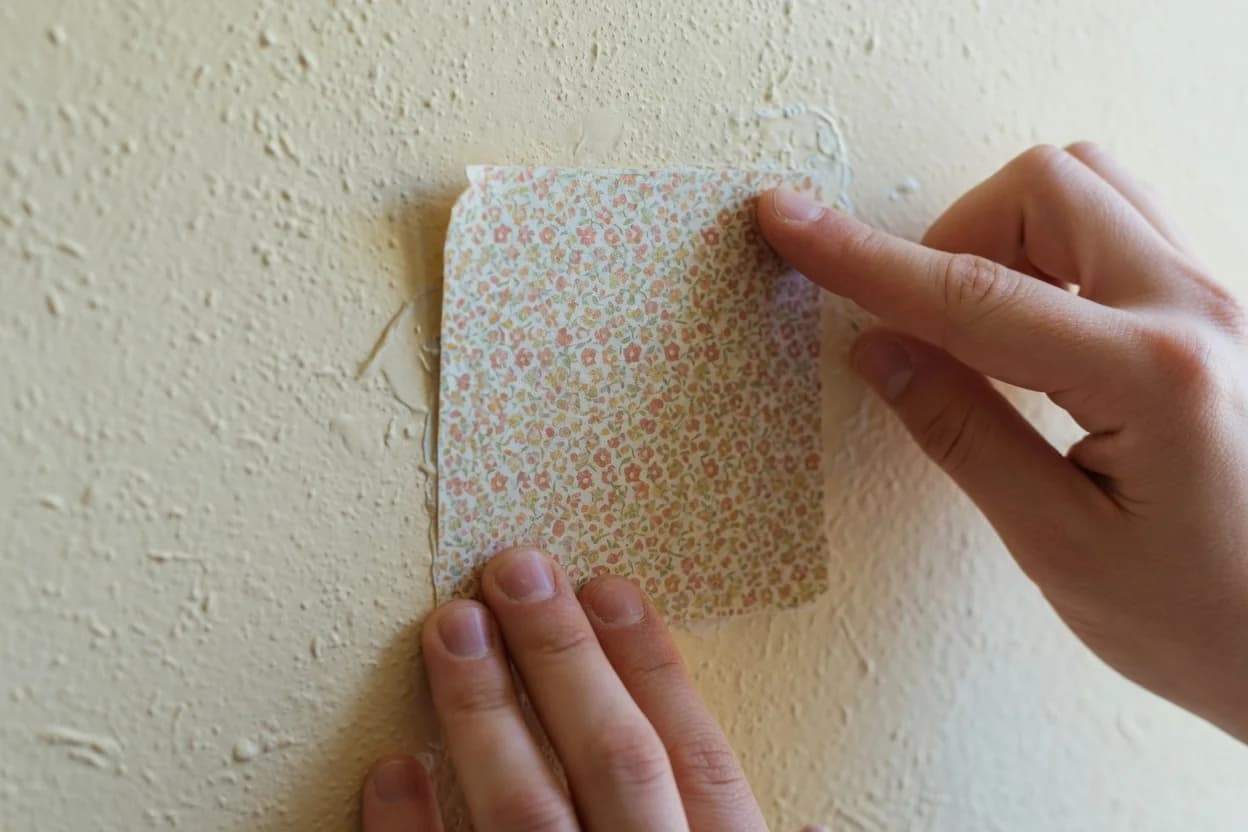
If your fixed red is a painted wall you're willing to change, even a temporary fix like peel-and-stick wallpaper in a warm neutral buys you the clean slate the main strategy requires. But repainting might not be in the cards this season. In that case, the jewel-tone pivot is your move.
Right now, before you close this tab: Walk the room and remove every object that reads as red, burgundy, rust, or terracotta. Don't evaluate the greenery yet. Just remove the reds. Stack them in a closet or a bin. This takes ten minutes and it's the single highest-leverage move in the whole process.
Same day, once the red is gone: Step back and assess what survived. Keep the bare greenery, the white lights, the pinecones, and any neutral candles or textiles. Swap out anything plaid, tartan, or metallic-threaded for solid velvet or boucle. Change the textiles before you buy anything new.
This week: Audit your lighting. Replace any cool white or bright white bulbs with 2700K warm white. Move string lights from window outlines to organic placements—mantels, hurricanes, bowls. Add one table lamp where you currently have only overhead light. The goal is glow, not twinkle.
The house that feels intentional in February wasn't decorated with more skill. It was edited in the right sequence. Remove the color that triggers Christmas first, then decide what's left.