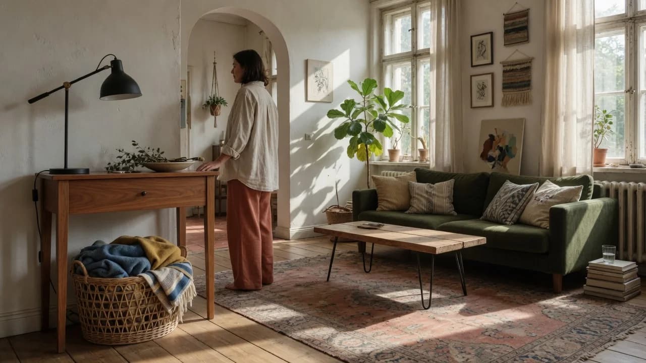
An interior designer will tell you to check undertones before you check anything else, and there's a reason. You can have a room full of pieces that individually look great. A walnut table, rattan chairs with black metal legs, a brass lamp. And still feel something is off without being able to name it. The materials are working from different temperature playbooks, and your eye catches the dissonance before your brain does.
Most advice stops at "create contrast." But contrast without temperature coordination produces chaos, not drama. A cool chrome lamp next to a warm cherry side table looks like a fight; a matte black metal frame next to the same cherry reads as intentional. The difference is undertone temperature.
The tension is genuine: you have followed the rules and the room still doesn't hang together. What makes a space feel deliberate isn't matching species; it's coordinating temperature. Get that right, and you can mix oak with mahogany and brass with matte black without a hint of mismatch.
The Undertone System: Temperature Before Everything
Every material in your room broadcasts a temperature. Woods, metals, and woven materials all carry undertones, subtle hues sitting beneath the surface color, and those undertones sort reliably into warm and cool families. The reason a room looks mismatched is almost never that you mixed materials or even species. It's that you mixed temperatures without realizing it.
Warm woods carry yellow, orange, or red in their base. Cherry is pink-red. Mahogany leans red-brown. Most walnut has a reddish or purplish cast, though black walnut can read as a cool neutral depending on the cut.[3] On the cool side, ash reads gray or silvery. Maple has a creamy, sometimes faintly yellow base, but lacks the golden warmth of oak. White oak is the most neutral of the common species, beige-gray rather than honey, which is why it pairs easily with both temperature families.
Metals follow the same logic. Brass, copper, bronze, and gold are warm. Chrome, stainless steel, nickel, and aluminum are cool. A handful of finishes work as temperature neutrals: matte black, oil-rubbed bronze, and gunmetal. These bridge finishes become essential when you are mixing across temperatures. Natural rattan and cane default warm, but treated versions shift: whitewashed or gray-stained rattan lands cool, while black-painted rattan becomes a neutral bridge.
The better question is not whether any single piece is warm or cool, but what temperature dominates the room you already have. Fix your anchor temperature first. Identify the largest wood surface, the primary metal finish on hardware or lighting, the tone of a major rattan piece. Then select everything else from the same family or from the bridge column. When designers say a room feels cohesive, what they mean is that the temperature story is consistent.
Take a photo of your room with your phone and switch it to black and white. The temperature differences will jump out in grayscale before you can even name them. This is not about memorizing every species' undertone. Most people need to identify only their anchor temperature and one or two supporting ones.
The table below maps common materials to their temperature families:
| Temperature | Wood | Metal | Rattan/Cane |
|---|---|---|---|
| Warm | Cherry, mahogany, walnut (most), red oak, teak | Brass, copper, bronze, gold | Natural rattan, honey cane, caramel finishes |
| Cool | Ash, maple, birch, white oak | Chrome, stainless steel, nickel, aluminum | Whitewashed rattan, gray-stained cane |
| Neutral Bridge | Black walnut (some cuts), ebony, painted black | Matte black, oil-rubbed bronze, gunmetal | Black-painted rattan, dark-stained cane |
This is a diagnostic tool, not a rigid sorting exercise. Before you buy another piece, identify the dominant temperature already in the room. That is your anchor. Everything else answers to it.
The 60-30-10 Rule for Materials: One Leader, Two Supporters
Temperature coordination gets you harmony. Proportion gets you hierarchy, and hierarchy is what prevents a room from feeling like a material free-for-all. According to Homebuilding & Renovating, the 60-30-10 rule, originally a color guideline, adapts seamlessly to materials: roughly 60% of the visual weight goes to one dominant material, 30% to a secondary material, and 10% to an accent.[2]
Mismatched materials don't clash because the species are different; they clash because their undertone temperatures fight. No single material has enough visual real estate to anchor the space without a clear temperature leader. Pick one dominant material first. In most American living rooms, that dominant material is already decided for you by the flooring or the largest casegood. If you have hardwood floors throughout, the floor sets the 60%. In a dining room, the table surface typically dominates. Choose the material you most want to live with, because it will touch everything else.
The 30% layer is your secondary material, the one that provides deliberate contrast without competing. If wood dominates, metal makes a natural 30% candidate through lighting, chair legs, or shelving frames. Rattan typically works best as the 30% or 10% layer because its woven texture reads heavier than its actual mass suggests. A pair of rattan chairs around a wood table gives you a clean 60/30 split with metal legs filling the 10%. The numbers need not be precise, but the hierarchy must be visible. Stand in the doorway and squint. If no single material clearly leads, the room will read as unsettled no matter how well you matched undertones.
Repetition Makes It Look Intentional
A single brass lamp in a room full of chrome reads as a mistake. That same brass lamp paired with brass drawer pulls six feet away reads as a design choice. Room & Board's design team spells out the rule plainly: each wood tone and metal finish needs at least two appearances to register as intentional, and three is better.[1]
This matters more for metal than for wood, because metal finishes tend to be accents rather than major surfaces. If your dominant metal is matte black, it should show up in more than one place. Cabinet hardware on one side of the room and a floor lamp on the other. A mirror frame and a side table base. Distribute, don't cluster. Rattan's woven texture is distinct enough that a single rattan chair sitting against smooth-material furnishings can look isolated. Repeat it elsewhere: a rattan pendant light, a woven basket, a cane-front cabinet door. The repetition signals intention, and intention is what separates a curated room from a room that just accumulated stuff.
And if you cannot repeat a material at least twice in the same room, consider replacing it. A lonely finish reads as an orphan, and no amount of undertone coordination rescues it. This isn't about buying more things. Repetition can come from moving existing pieces between rooms, and it often does.
When the Rules Meet Your Actual House
The undertone system runs into trouble with one common scenario: fixed architectural elements you cannot change. If your home has 1990s honey-oak floors (warm, yellow-gold, and very bossy), you are locked into a warm palette unless you introduce a deliberate bridge. Painting the walls crisp white will not neutralize the floor's warmth enough to make cool ash furniture feel at home. What works instead: lean into the warmth but bring in matte black metal, a neutral bridge, and natural rattan, a warm secondary material. The matte black steps between the honey oak and any cooler accents you want to introduce through textiles or art.
The same problem appears with mixed-era furniture. Inheriting a mid-century walnut credenza in a room you were furnishing with contemporary white oak and chrome forces a choice. Either the walnut becomes your anchor temperature, which means trading the chrome for brass or matte black, or the walnut piece gets relocated to a room where warm tones already dominate. The system does not require you to love your anchor. It does require you to be honest about what the anchor is. If you ignore the existing dominant temperature and decorate around a fantasy anchor, the room will fight itself. And the cost adds up. You will spend money replacing pieces one at a time, chasing a cohesion that never arrives because the underlying temperature mismatch was never addressed.
This afternoon, walk into the room and identify the single largest material surface you cannot easily change. That is your anchor. Determine its temperature using the table in section one and write it down. You now have a fixed reference point for every future decision.
This week, remove one piece that fights your anchor temperature. Move it to a space where the temperatures align; you don't have to get rid of it. Then pick a bridge finish, matte black being the safest starting point, and add two pieces that use it so the bridge appears at least twice.[1]
Over the next month, use the 60-30-10 lens on every purchase. If your anchor material already occupies about 60% of the visual weight, shop only for the 30% or 10% layers. Rattan works best at 10% unless you are deliberately building a coastal room where it carries the 30%. Each decision will pull the room in the same direction instead of fighting the last one.