You found it. A lacquered brass floor lamp with a silhouette that stopped you mid-aisle at the Goodwill on Route 9. Or a velvet armchair in a shade of green you can't name but can't stop thinking about. You brought it home, placed it in the living room, and something went wrong. The piece that felt electric under fluorescent thrift-store light now reads as an accident. It doesn't belong.
You aren't alone in this. The most common decorating question I hear isn't about paint colors or furniture placement. It's about making one standout thrift find stop looking like it wandered into the wrong house. The solution isn't to regret the purchase or bury the piece in a spare bedroom. It's to understand what the piece is actually telling you about the room it now lives in.
Put more precisely: the problem usually isn't the find. It's that the rest of the room hasn't been given a reason to acknowledge it. A statement piece demands a room that speaks the same language, even if at a lower volume.
That's the tension: the bolder the find, the more the room has to work to meet it. Most advice tells you to tone the piece down. The better move is to bring the room up.
The Problem: A One-Way Conversation
When a thrifted statement piece feels wrong in a room, the mismatch typically lands in one of three places: color, material language, or visual weight.
Color is the most obvious offender. A burnt-orange velvet ottoman against gray walls and a beige sofa reads as an error because nothing else in the room acknowledges that orange exists. The eye registers the piece, searches for confirmation, finds none, and files the whole arrangement as unintentional.
Material language is subtler but equally punishing. A raw-wood mid-century credenza placed among glossy laminate furniture creates a texture gap that no amount of rearranging will fix. The pieces aren't having the same conversation.
Visual weight is the one people feel but rarely name. If your statement find is a delicate wrought-iron side table and the rest of the room is overstuffed sectionals, the find disappears. If it's a massive carved armoire in a room of spindle-legged chairs, it dominates in a way that reads as clutter, not intention. Either way, the hierarchy is broken.
What ties all three failures together is that they share the same cause: the room was designed first, and the find was inserted into it. The sequence is backward.
The Anchor Principle: Let the Find Lead
In any visually coherent room, one element sets the terms. Interior designers call this the focal point; perception researchers call it the visual anchor. Eye-tracking research in interior environments confirms that décor composition significantly redirects attention during the critical first seconds of observation, guiding where the gaze lands and what the brain registers as important.[3] When no anchor exists, the gaze scatters. When the anchor is clear, the room feels resolved even before the viewer can articulate why.
Your thrift find, whether you meant it to or not, is now competing for that anchor position. The practical choice is to let it win.
This doesn't mean every other piece in the room needs to be thrifted. It doesn't mean the room becomes a museum to one object. It means the find becomes the reference point from which every subsequent decision flows: color, finish, scale, and texture all get measured against it.
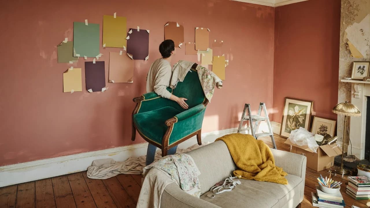
The method is straightforward. Pull two to three colors from the piece. Identify its dominant material finish. Note its approximate visual weight relative to the room. Then treat those three data points as constraints, not suggestions.
Working the Palette: The Color Cascade
The 60-30-10 rule is the most durable framework in interior color theory for a reason. In a balanced room, roughly 60 percent of the visual field is a dominant color, 30 percent a secondary color, and 10 percent an accent. The rule originates from the Golden Section, a mathematical proportion observed in nature and adapted to design.[1]
When you're building around a thrift find, invert the conventional application. Instead of choosing a palette and then shopping, let the find dictate the proportions.
Say your statement piece is that emerald-green velvet chair. The green becomes your anchor. It doesn't need to cover 60 percent of the room by itself. It needs to be the source from which you derive your three colors. Pull the emerald as your secondary color at roughly 30 percent of the room, through a second upholstered piece or drapery. Pull a softer, related tone for the dominant color at 60 percent, on walls or a large rug. And pull whatever third color already exists in the piece: a piping detail, a button, a subtle undertone in the fabric. That becomes your accent at 10 percent, appearing in throw pillows or a small ceramic.
The Spruce describes this approach as letting proportions "give your room a balanced and harmonious look."[1] The difference here is that you're not starting from a blank palette. You're reverse-engineering the rule from something you already own. The find supplies the accent color by default; everything else cascades from there.
If the piece is neutral-toned—carved wood, raw ceramic, natural fiber—the palette decision shifts from color to texture. A warm walnut credenza suggests matte black, undyed linen, and one metallic finish repeated at least twice elsewhere in the room.
Material Echo and When Scale Works Against You
Color gets the room to acknowledge the piece. Material echo makes the relationship feel inevitable.
For every dominant finish on your statement find—brass, wood grain, glazed ceramic, velvet—place at least one other item in the room that shares it. Not a match. An echo. A brass lamp base picks up a brass picture frame across the room. The raw oak legs on a thrifted table connect to an oak-framed mirror. These repetitions create what designers call visual pathways: lines of relationship that keep the eye moving through the space instead of stalling on the one object that doesn't fit.
Scale is where the anchor method hits its limit, and this is worth naming directly. If your statement find is physically small—a hand-painted vase, a single ceramic lamp—and the room is large with high ceilings, no amount of color pulling will make that piece anchor the space. The find reads as an accent regardless, and trying to force it into the anchor role will make the room feel under-furnished. In that scenario, the piece works better as a secondary focal point: let something else carry the room's visual weight and use the find as the 10-percent accent that gives the palette its personality.
The same problem appears at the other extreme. A statement piece that's dramatically oversized for its room—a nine-foot dining table in an eight-foot dining nook—can't be styled into submission. The room needs to give it more space or the piece needs a different home. That's not a styling failure. That's a measurement problem, and no framework fixes it.
Coast Consignment's guidance aligns here: "Too many statement pieces competing for attention. Multiple focal points create visual confusion rather than sophisticated layering. Choose one standout piece per room and let everything else support it."[2] One anchor. One room. The math doesn't work otherwise.
And here's where the reframe matters. That thrift find isn't disrupting your room; it's revealing what the room was missing. The awkwardness you felt when you first placed it wasn't the piece's fault. It was the room's unfinished business becoming visible.
If your thrift find carries strong color: pull two to three hues from it, assign them to the 60-30-10 framework starting with the find as your 10-percent accent, and repaint or re-textile the largest surfaces in the room to match the derived dominant color. This is the highest-impact, lowest-cost path. A gallon of paint runs $40 to $70 and changes more about how a room reads than any single furniture purchase will.
If your thrift find is neutral in color but distinctive in material: focus on material echo. Identify the piece's dominant finish and place two to three supporting items in the room that share it. Add one contrasting texture—glass against wood, linen against metal—to prevent the room from feeling matched rather than composed. This path costs less but requires more patience; finding the right echo pieces at thrift stores or estate sales can take weeks.
If your find is small-scale or oversized relative to the room: do not attempt to make it the anchor. Reclassify it as a secondary focal point or an accent piece. Let the room's existing largest element—a sofa, a bed, a dining table—hold the anchor position, and use the find to sharpen the palette or add the one texture the room was missing. If the piece and the room are fundamentally mismatched in scale, no styling technique will bridge the gap. The right move is to move the piece to a room where its proportions make sense.
Building a room around one thrift find is cheaper than designing from scratch and more personal than copying a catalog. But it only works when you treat the find as the starting condition, not the afterthought. The room catches up when you stop asking the piece to belong and start giving the room reasons to agree with it.